In a world overflowing with visual stimuli, making a mark requires more than just talent; it requires boldness. Bold graphic design styles are pivotal in creating an unforgettable visual impact that resonates with an audience. From electric colors that catch the eye to unique typography that speaks volumes, these design styles are not just a choice—they're a statement. But how does one navigate the vibrant world of bold graphic design? Let's dive into the essentials using the 5Ws and H framework to explore how these styles make a lasting impression.
Who Uses Bold Graphic Design Styles?
Bold graphic design styles are used by a wide range of people and organizations. Experienced designers rely on them to keep work fresh, while newcomers use bold choices to stand out quickly. Businesses use bold design to strengthen their brand identity, ad agencies employ it to grab attention, and nonprofits turn to it when raising awareness for important causes. In short, anyone who needs to stand out in a crowded visual world benefits from bold design.
What Makes Bold Graphic Design Styles Stand Out?
Bold design is defined by a few clear traits. These include strong color palettes, dynamic typography, and high-contrast visuals that immediately catch the eye. Designers may also use asymmetrical layouts, large images, or experimental type to create work that feels expressive and memorable. Whether minimal or maximal, the goal of bold graphic design is always the same: to make a lasting impact.
When Did Bold Graphic Design Styles Become Popular?
The roots of bold graphic design styles go back to mid-20th-century movements like Pop Art, famous for its bright colors and striking images. But it was the digital age that pushed bold design into everyday use. With the rise of websites and social media, the need for visuals that cut through digital noise has grown. Today, bold design remains one of the most effective ways to grab attention and stay memorable.

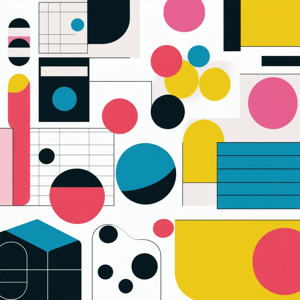
AI made with Heather Crank
Where Are Bold Graphic Design Styles Most Effective?
Bold graphic design styles work best in places where attention needs to be captured fast. Online, they shine in social media posts, websites, digital ads, and mobile apps. Offline, they stand out on posters, billboards, and packaging—anywhere ideas must be shared quickly. In both digital and print, bold design is a powerful way to make messages clear and memorable.
Why Choose Bold Graphic Design Styles?
Bold design creates a strong first impression and keeps viewers engaged. It’s memorable, emotional, and helps brands build stronger connections with their audiences. For businesses, this often means clearer brand identity and higher recognition. In today’s fast-scrolling world, bold graphic design styles ensure your message isn’t overlooked.
How to Implement Bold Graphic Design Styles
Using bold design requires balance—too much can overwhelm, too little may fade into the background. Here are a few key ways to apply it effectively:
- Color: Use bold colors to highlight important details. Contrasts make designs pop, while complementary colors add balance.
- Typography: Choose fonts that are eye-catching yet readable. Play with size and placement for emphasis but keep clarity first.
- Imagery and Layout: Large images and asymmetrical layouts can guide the eye and add energy to a design.
- Consistency: Be creative, but keep designs aligned with your brand’s overall style and message.
Case Study: Nike and Bold Graphic Design Styles
Nike has long embraced bold graphic design styles to keep its brand iconic and instantly recognizable. From oversized typography in its Just Do It campaigns to striking use of black-and-white photography paired with vibrant accents, Nike’s designs grab attention at a glance.
This approach not only reinforces Nike’s strong brand identity but also creates emotional connections with its audience. By using bold visuals across billboards, social media, and packaging, Nike ensures its message is clear, powerful, and memorable worldwide.
FAQ: Bold Graphic Design Styles
What are some examples of bold graphic design styles?
Popular styles include:
- Minimalism with impact – clean layouts paired with striking colors or type
- Retro/Vintage – nostalgic fonts, textures, and vibrant palettes
- Pop Art – bright colors, thick outlines, and repetition
- Memphis Design – playful geometric shapes and patterns
- Brutalism – stark layouts with bold contrasts
- Glitch Art – digital “errors” used as bold visuals
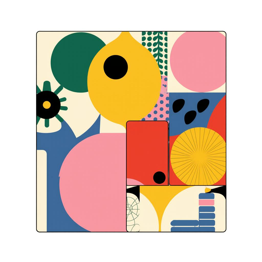
AI made with Heather Crank
How can bold graphic design styles improve visual impact?
They:
- Grab attention quickly
- Simplify messages for clarity
- Create lasting impressions
- Evoke emotional responses
- Strengthen brand identity
What techniques are used to create bold designs?
Key techniques include:
- Bright, contrasting color palettes
- Oversized and striking typography
- Dynamic layouts that guide the eye
- Strong, memorable imagery
What should be considered when choosing a bold style?
Think about:
- Purpose – does the design fit the project’s goal?
- Audience – younger groups often respond well to bold visuals
- Brand – keep consistency with brand values
- Medium – digital vs. print may call for different choices
- Balance – bold should stand out without overwhelming
By applying bold graphic design styles with care, you can make visuals that attract attention, communicate clearly, and leave a memorable impression.
Conclusion
Bold graphic design styles are much more than visual appeal; they are a means to communicate powerfully and memorably in a saturated visual world. Whether it’s through vibrant colors, daring typography, or striking imagery, bold design offers a unique approach to making a statement. By understanding and implementing the elements discussed, designers can harness these styles to create works that not only attract but also linger in the audience’s mind, thus amplifying the message they wish to convey.