In the ever-evolving world of digital design, the need for consistency, scalability, and seamless user experiences has never been more crucial. A "design system UI" is the backbone of this dynamic environment, enabling designers and developers to craft interfaces that are not just aesthetically pleasing but also functional and user-centric. By offering a structured approach to design, a design system UI serves as a toolkit filled with UI materials, guiding both novice and expert designers in creating cohesive digital products.
Understanding Design System UI
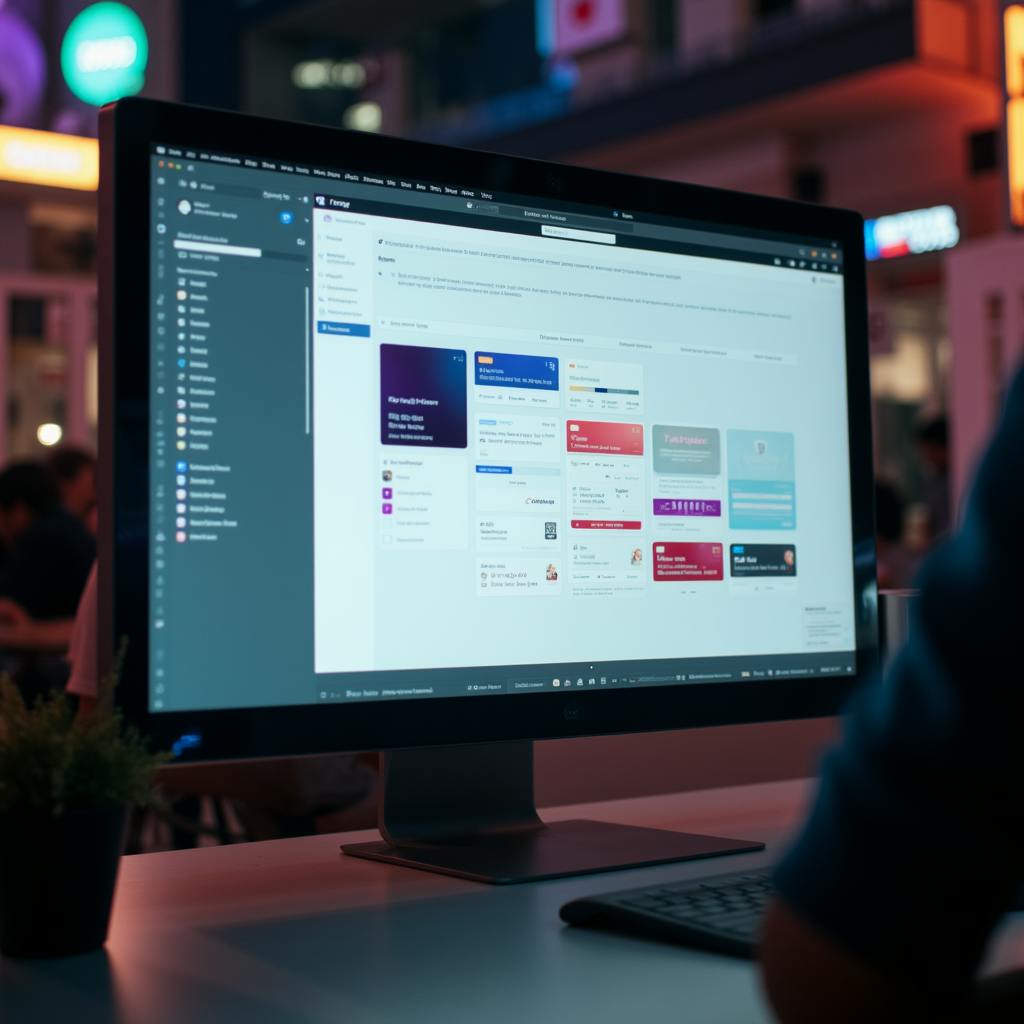
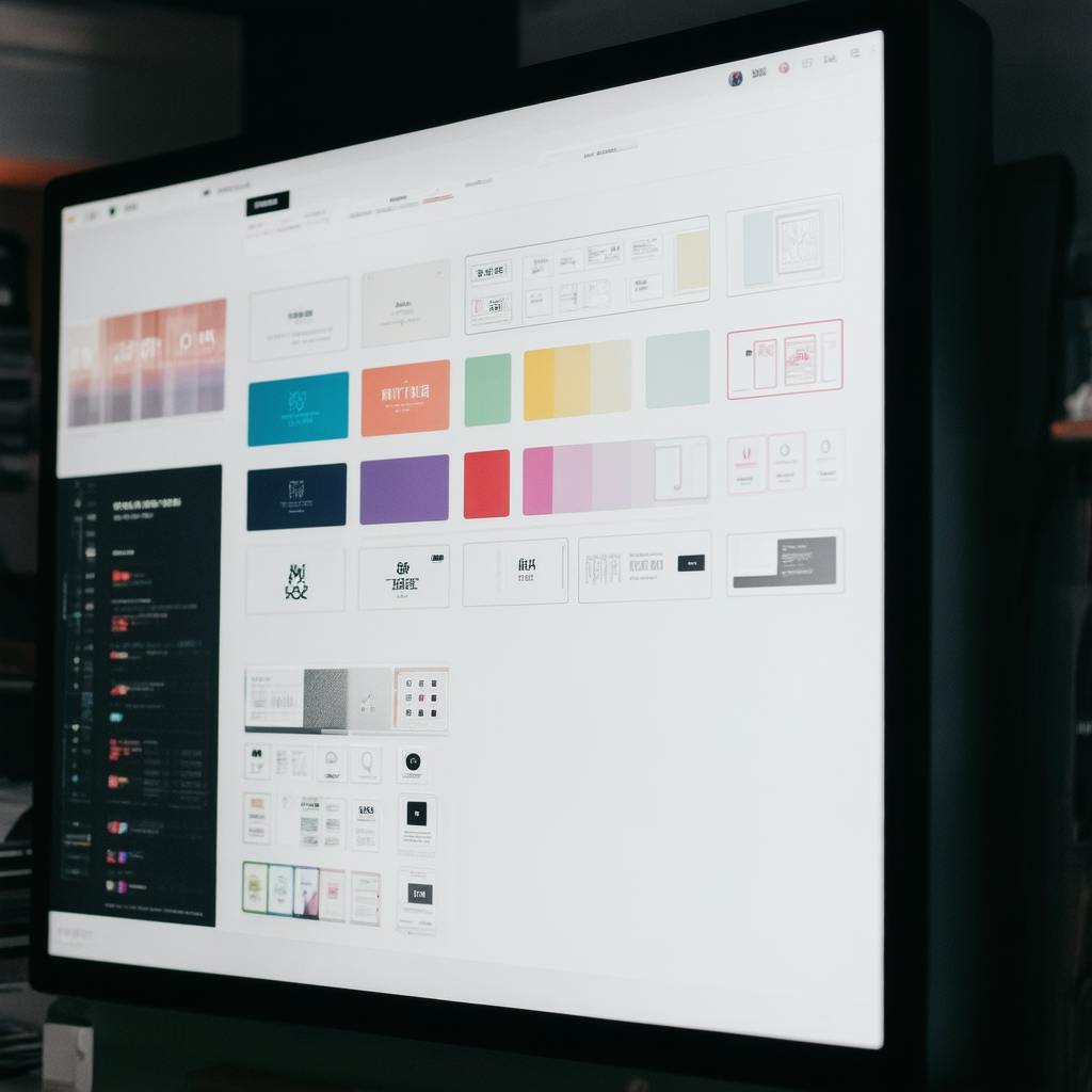
At its core, a design system UI is a comprehensive collection of reusable components, guidelines, and standards that streamline the design process. These systems ensure uniformity across various platforms and products by maintaining a consistent brand language. Examples like Google's Material Design or IBM's Carbon Design System illustrate how design systems bridge the gap between design and systems thinking, providing a solid foundation for UI architecture.
Key Components of a Design System UI
- UI Materials: Every design system UI consists of a library of UI materials, including buttons, forms, icons, and typography. These elements are meticulously crafted to ensure a harmonious look and feel across all applications, thereby reducing the cognitive load on users and fostering brand familiarity.
- Design Guidelines: Establishing rules and practices for using UI materials is another vital aspect. Design guidelines offer direction on spacing, color schemes, and interactions, ensuring that every design decision aligns with the overall brand ethos.
- Scalability: One of the primary advantages of a design system UI is its ability to scale effortlessly. Whether your product evolves over time or expands across different devices and platforms, a well-structured design system ensures that the transition is smooth and the user experience remains intact.
- Collaboration and Efficiency: By providing a shared language and resources, design systems enhance collaboration among cross-functional teams. Development becomes more efficient as components are reused and not reinvented—making iteration and innovation faster and less resource-intensive.

AI made with YK
Addressing Common Questions
Why is a design system UI important for startups?
For startups, establishing a design system UI early can lead to significant time and cost savings. It prevents resource wastage on inconsistent design efforts and helps in creating a strong initial brand presence.
How do design system examples inspire innovation?
By studying established design system examples, like Shopify’s Polaris or Mailchimp’s Pattern Library, teams can learn best practices and avoid common pitfalls, thus accelerating the innovation cycle.
Can a design system UI evolve over time?
Absolutely. A robust design system UI is flexible and adaptable, growing alongside technological advancements and changing user needs. Regular updates ensure the system remains relevant and valuable.
Frequently Asked Questions: Design System UI
What is a design system UI and how is it used in creating interfaces?
A design system UI is a comprehensive set of standards, principles, tools, and components used to create a consistent and cohesive user interface across digital products. It includes guidelines for visual elements such as typography, color palettes, spacing, and imagery, along with interactive components like buttons, forms, and navigation.
The primary function of a design system UI is to serve as a blueprint for designers and developers. It provides a unified framework that helps teams design and build digital products efficiently and consistently. By using pre-defined components and guidelines, teams can ensure that every part of the interface aligns with the brand's identity and design principles.
Key Uses:
- Consistency: Ensures design consistency across all platforms, reducing discrepancies and maintaining brand integrity.
- Efficiency: Speeds up the design and development process by providing reusable components, reducing the need to start from scratch for each project.
- Collaboration: Facilitates better communication between design and development teams, as well as among stakeholders, by having a common reference point.
- Scalability: Eases the process of scaling interfaces for new features or products without sacrificing design quality or cohesiveness.
Why is consistency important in a design system UI?
Consistency is a cornerstone of any successful design system UI for several reasons:
User Experience:
- Intuitive Navigation: Consistent design helps users familiarize themselves with the interface quickly, making navigation intuitive and reducing cognitive load.
- Trust and Reliability: Users are more likely to trust a product that provides a uniform look and feel across its features, leading to increased user satisfaction and loyalty.
Development and Maintenance:
- Efficiency: Consistency reduces the complexity of development, making it easier to predict how new designs or code will behave. This leads to faster development cycles and reduced resource allocation.
- Error Reduction: With fewer variations in components, there are fewer chances for errors, inconsistencies, or bugs in the interface.
Branding and Identity:
- Brand Cohesion: A consistent UI strengthens the brand's visual identity, ensuring that the brand message is clear and recognizable across all touchpoints.
How does a design system UI contribute to the scalability of interfaces?
A well-constructed design system UI is crucial for scalability in several ways:
Reusable Components:
- Efficient Additions: By providing a library of reusable, modular components, teams can easily introduce new features or expand existing functionalities without rethinking the entire design from ground up.
- Consistency Across Scale: Ensures that even as new elements are added, the overall interface remains cohesive and aligned with the overall design philosophy.
Flexible Guidelines:
- Adaptability to Change: Design systems are designed to evolve. Guidelines and structures are built to accommodate updates, ensuring future scalability without major overhauls.
- Responsive Design: Components are usually designed to be responsive, ensuring they work across various devices and screen sizes, thus making scalability across platforms easier.
Resource Management:
- Streamlined Workflows: Improved collaboration and efficiency lead to better resource allocation, allowing teams to focus on innovation and growth while maintaining existing interfaces comfortably.
AI made with YK
What are some best practices in creating a design system UI?
When creating a design system UI, it's essential to follow certain best practices to ensure its effectiveness and longevity:
Establish Clear Goals:
- Define Purpose: Clearly outline what you want your design system to achieve. This will guide the structure and components you include.
Start Small, Iterate Often:
- Pilot with Core Components: Begin with essential components and extend the system as needed. Regular iteration allows for adjustments based on user feedback and technological advances.
Maintain Documentation:
- Comprehensive Documentation: Keep detailed and up-to-date documentation for all components, guidelines, and changes. This is crucial for onboarding new team members and for continued consistency.
Involve Cross-Functional Teams:
- Inclusive Collaboration: Involve designers, developers, content strategists, and stakeholders in the creation process to ensure the system meets diverse needs and perspectives.
Ensure Accessibility:
- Incorporate Accessibility Standards: Make sure all components meet accessibility standards (e.g., WCAG) to cater to users with disabilities and to comply with legal requirements.
Build for Flexibility:
- Scalable and Adaptable: Design your system to be flexible enough to adapt to new business needs, technologies, or market trends without requiring a complete redesign.
By adhering to these practices, a design system UI can become a powerful tool that not only enhances the user experience but also boosts the efficiency of design and development processes.
Conclusion
A design system UI is an indispensable tool for designing consistent and scalable interfaces. By integrating UI materials with clear guidelines and scalable architecture, it enhances collaboration, aligns branding efforts, and streamlines development processes. As digital products continue to grow in complexity, the role of a design system UI will only become more pivotal in crafting user experiences that are as seamless as they are sophisticated.
Ultimately, adopting a design system UI isn't just a strategic choice—it's a competitive advantage in creating interfaces that resonate with users and withstand the test of time.