Micah Lewis
Storyboard Artist
Looking Beyond the Mainstream
Lorena: I’ve been drawing since I was very little and that was the beginning of my journey. I never stopped drawing and took oil painting classes as a teen. Later I got a Master’s degree in Industrial Design and an MBA in Strategic Design. I worked for five years in publicity agencies with international clients as a designer and creative coordinator.
In these years, in addition to working with projects for national impact, I had a project chosen to be part of the Brazilian design biennial. Then in 2016, I became a freelance illustrator seeking a better quality of life. These times were very important for boosting my creativity and launching my illustrator career, as well as experimenting with new styles and techniques.
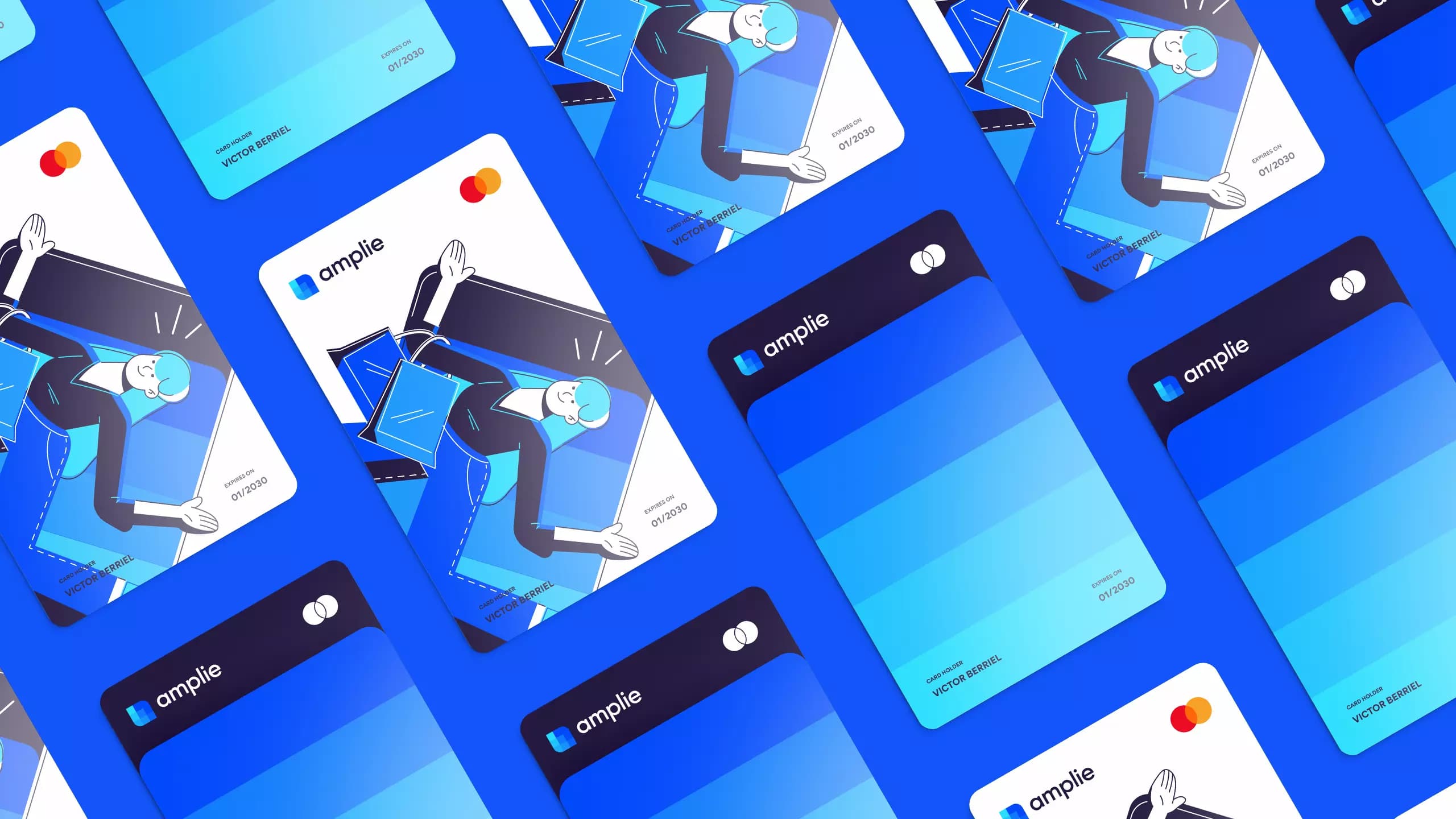
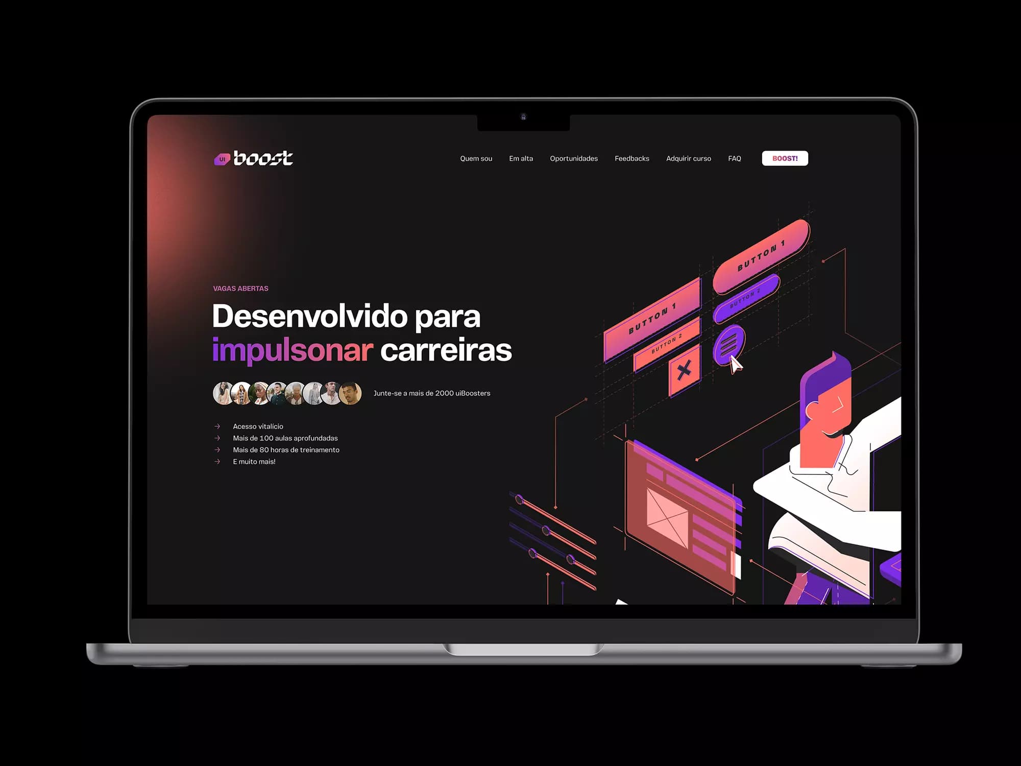
Since then, I illustrated visual identities for major Brazilian YouTube channels such as Nostalgia, Imaginago, and Nerdland. I was the winner of the Spoleto Illustration Contest in 2018 and a judge for the same contest in 2019. I made a children’s book with Plan International, also translated and launched across the world. In 2019 I launched my first Graphic novel, Pipo, at São Paulo Comic Con.
In the last two years, my focus was editorial illustration, so my style changed to fit more in the industry. Today, I feel reconnected with my background in design. My style is thus a mix of all my experience representing all of me.
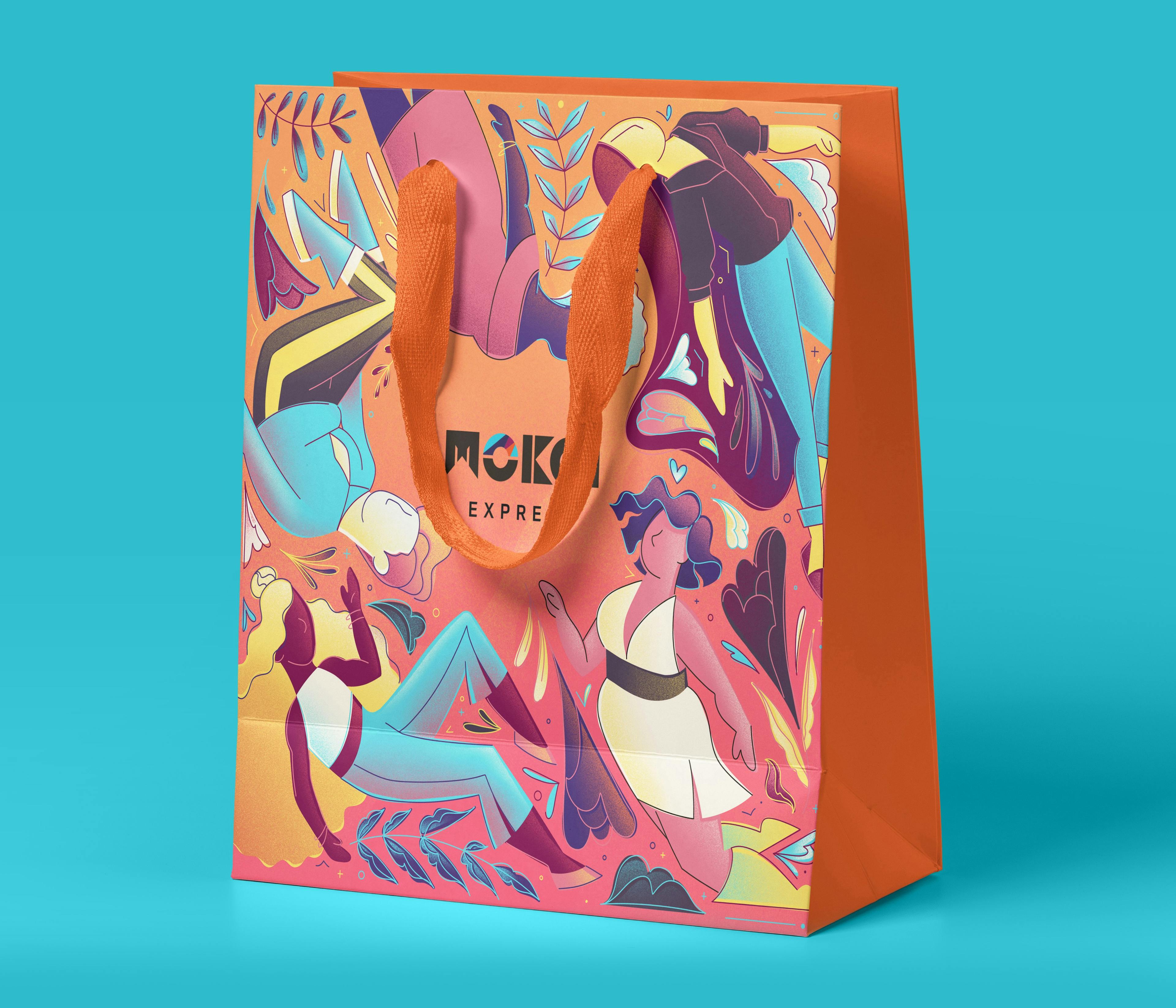
Lorena Giostri: I was born and raised in the countryside of Brazil. After adolescence, I moved to the capital and lived my adult life here. Because of that, I have a very wide range of references from lifestyles and incredible visual references that only Brazil can provide. The Brazilian culture is incredible and has a lot to explore. The biggest challenge in the international market is to gain the trust of customers who often prefer to hire people that are geographically closer and have a financial system similar to theirs.
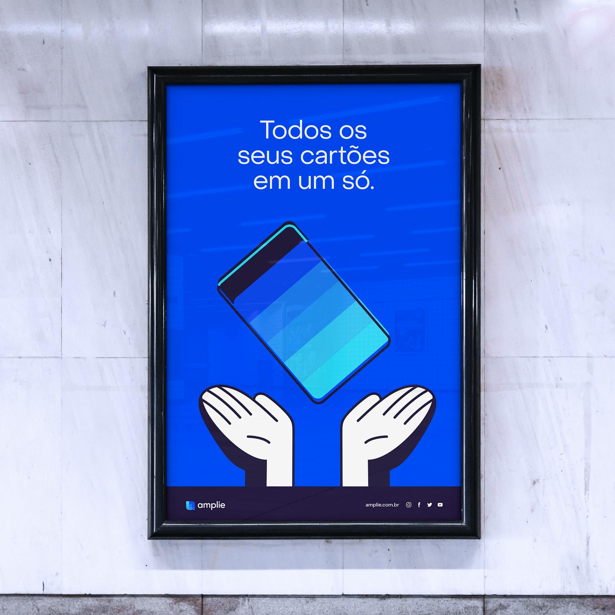
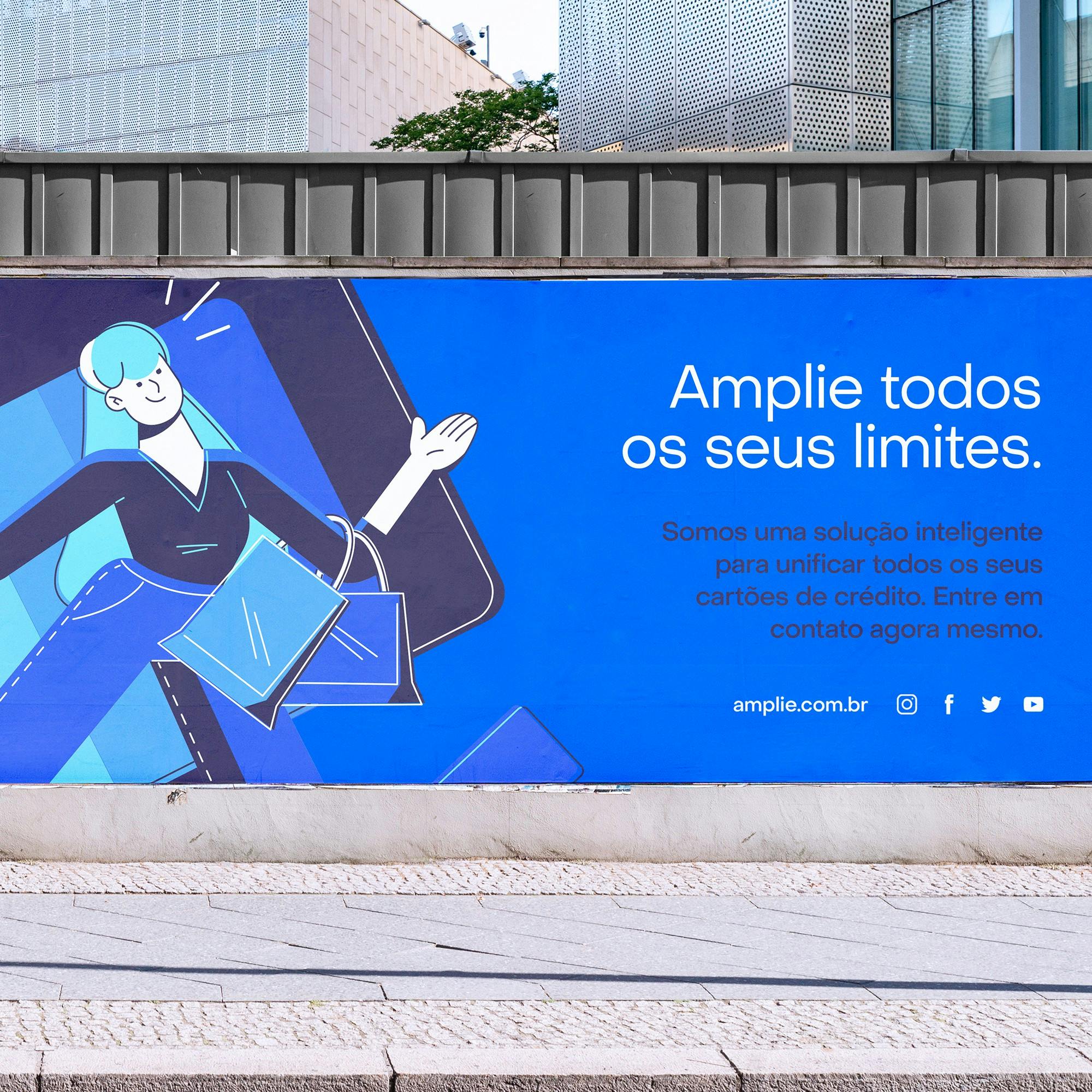
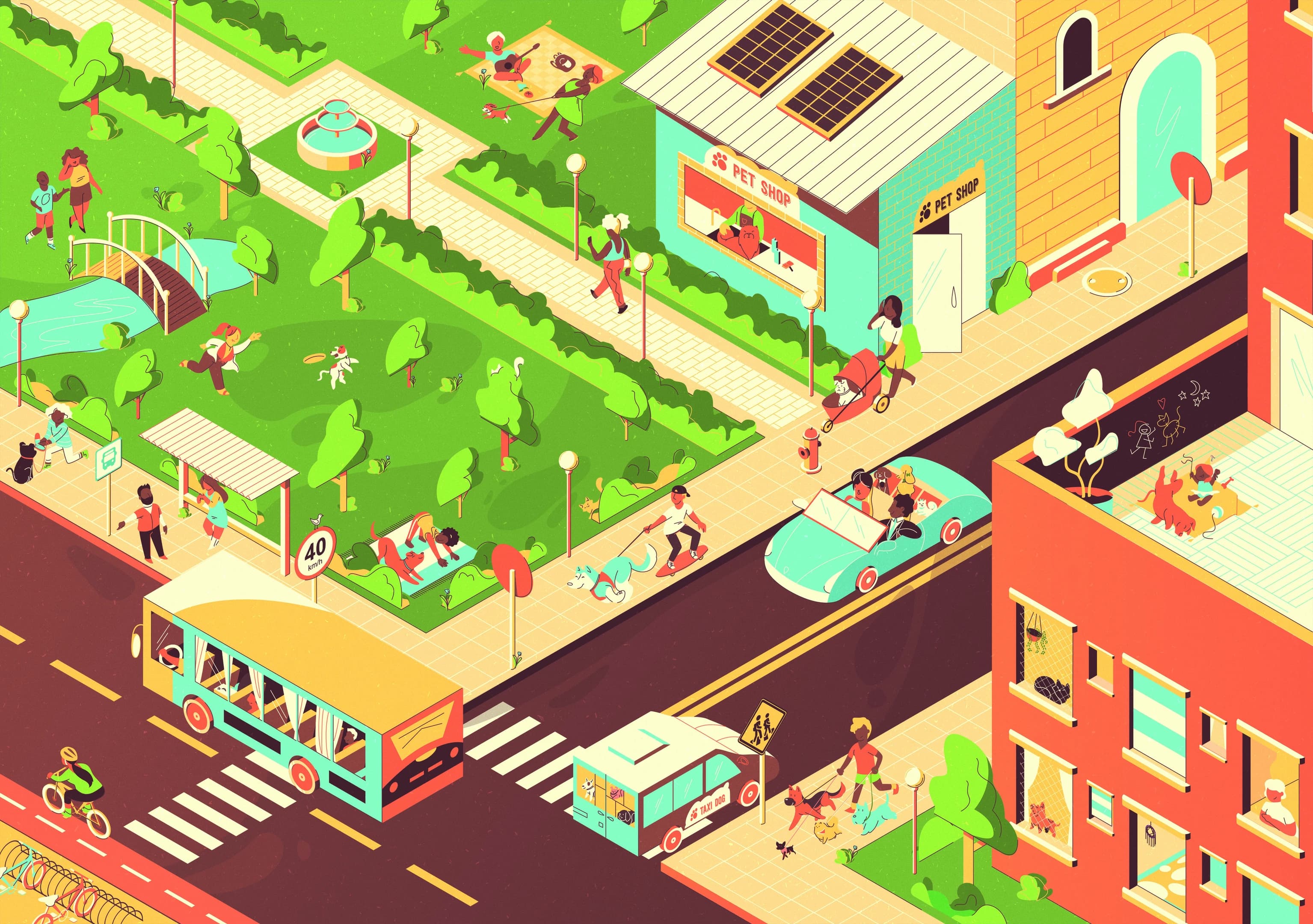
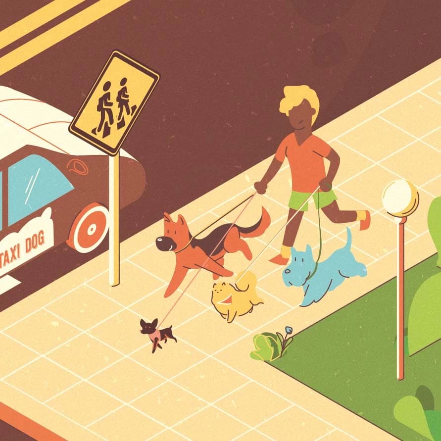
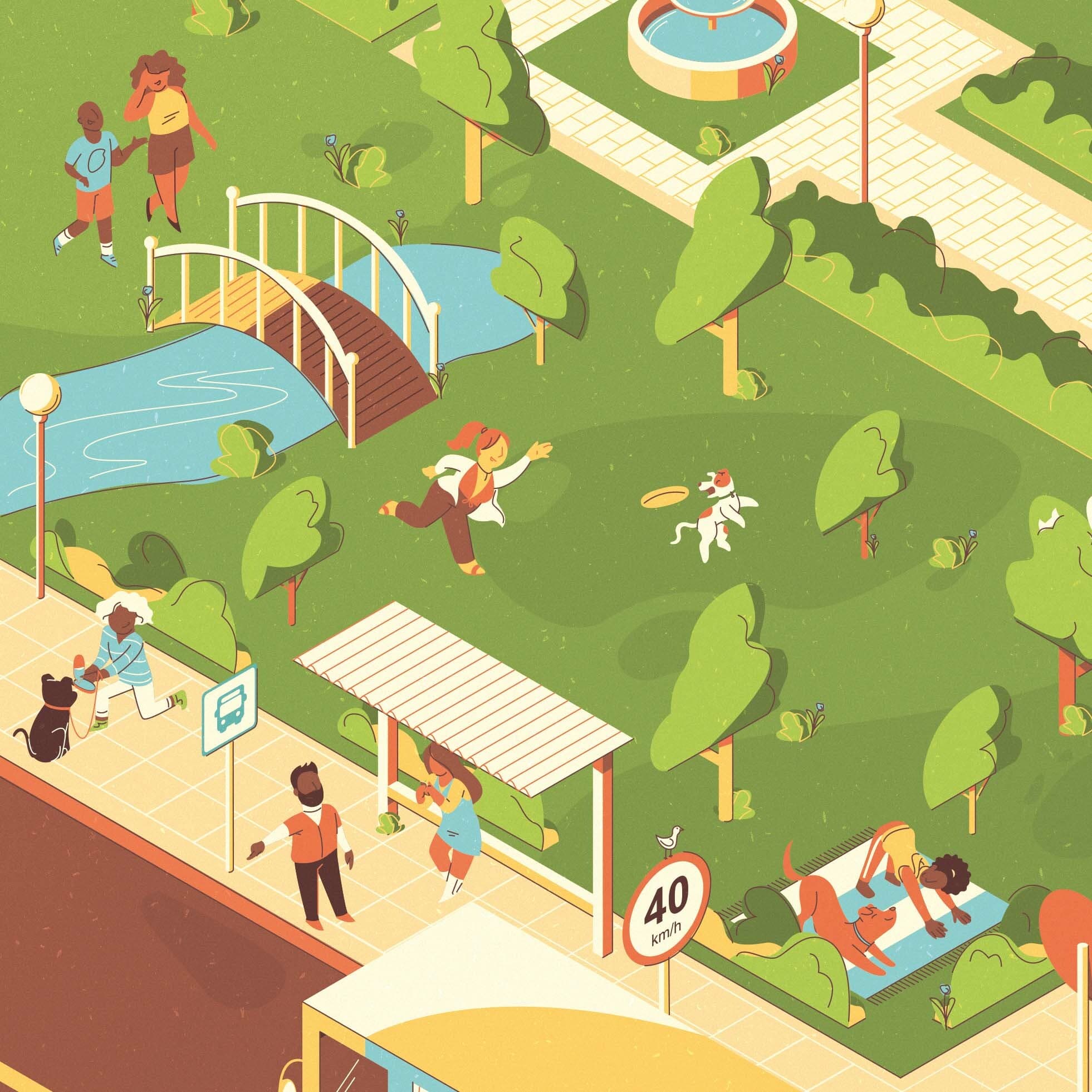
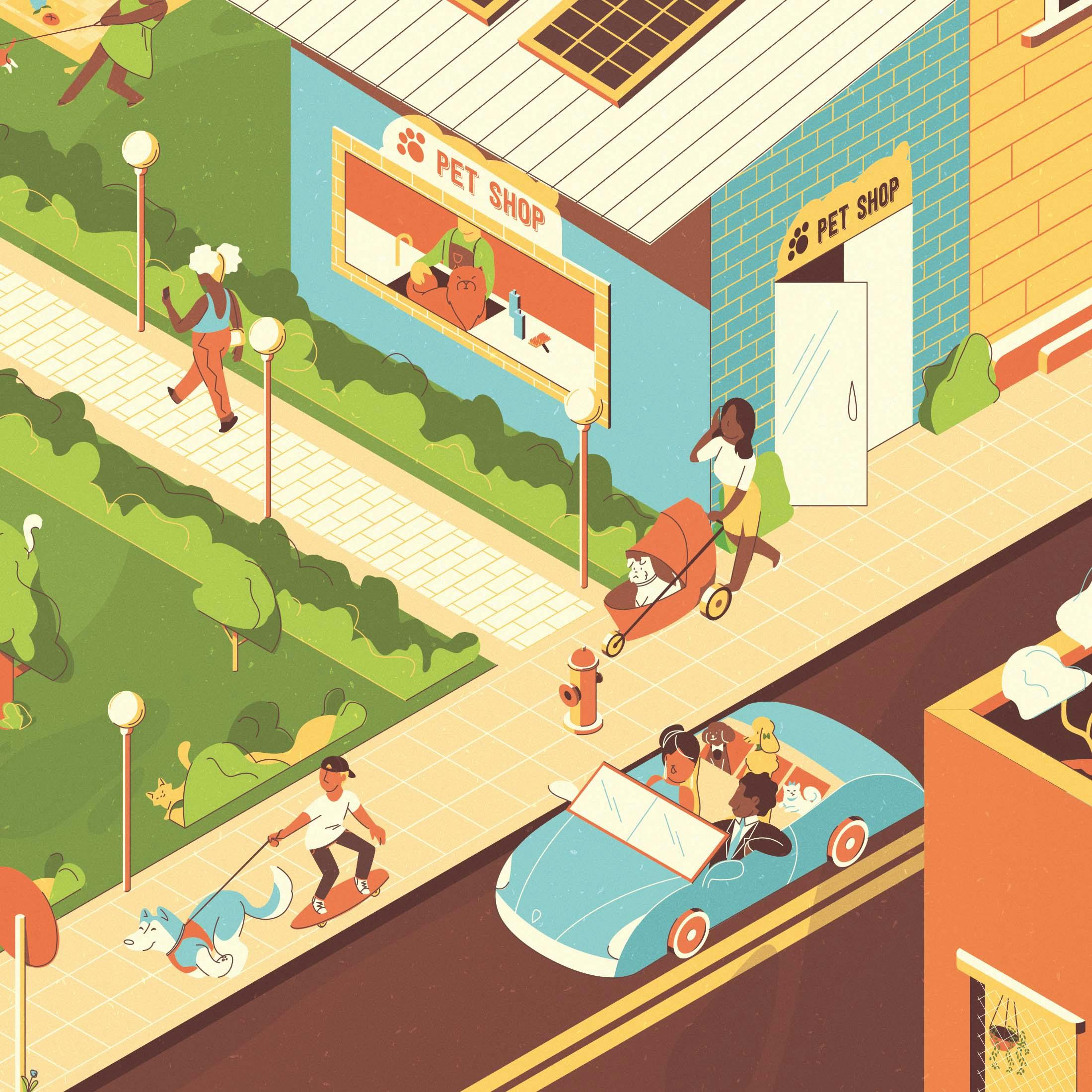
Lorena: I am very proud of the packaging illustrations I made for a pet’s shampoo line from IBASA. This project was a challenge from the beginning as it would just be one illustration to crop for three different packages. So the illustration needed to have some scenes happening in certain spots for the advertising agency to make the bottle designs.
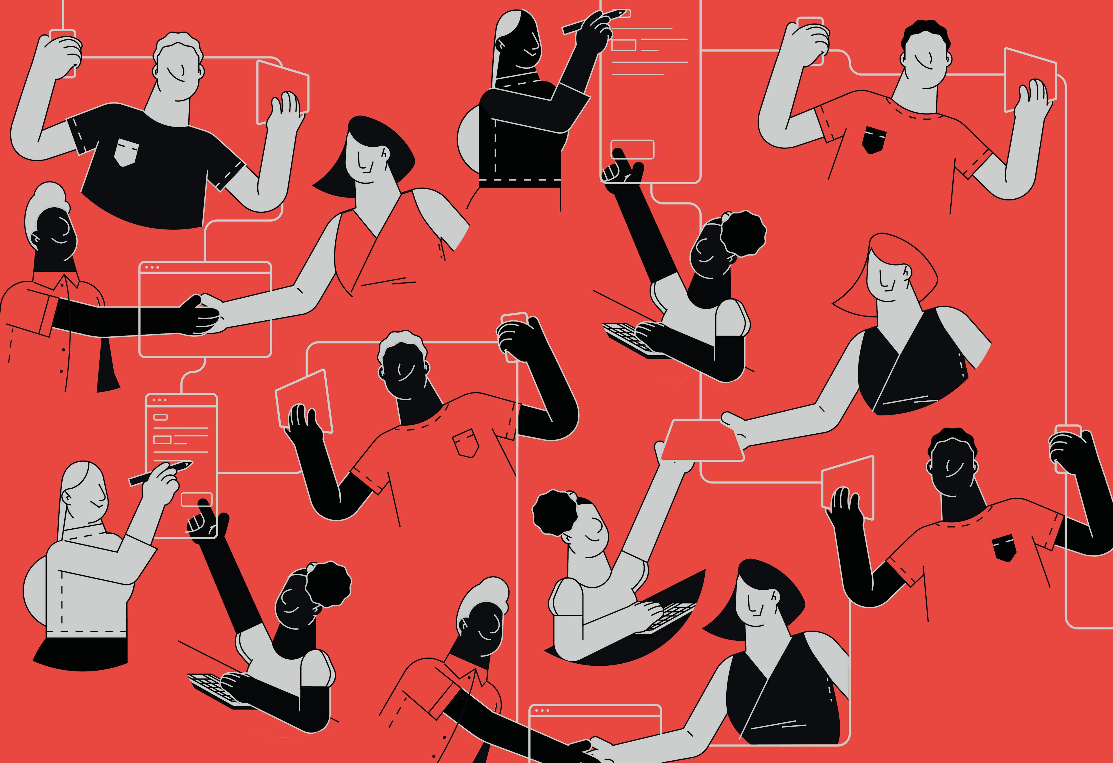
In the briefing, the agency asked for a city in an isometric view and at the same time with a strong influence of flat illustrations with distortion and a restricted color palette. We needed to have a lot of independent and complex scenes happening at the same time.
The work was amazing to do. I had to believe in my methodology until the moment of doing the coloring because I would need to get the mix of styles right. As it was a very large and complex illustration, it would take a long time to change some elements at that stage.
In addition to all this, it was developed in vector, which makes it a little difficult to make something of this complexity. In the end, the development went super well. I loved the result and sent it to my client who approved it right away.
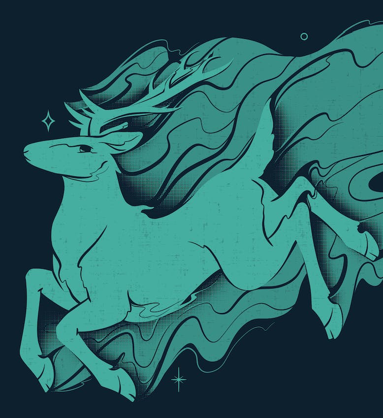
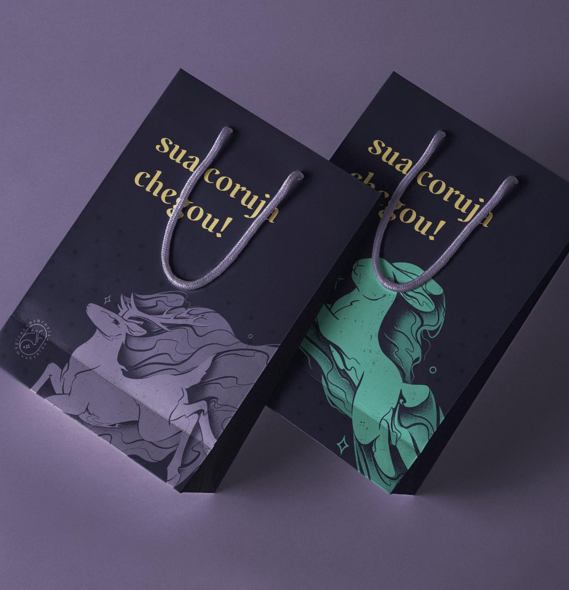
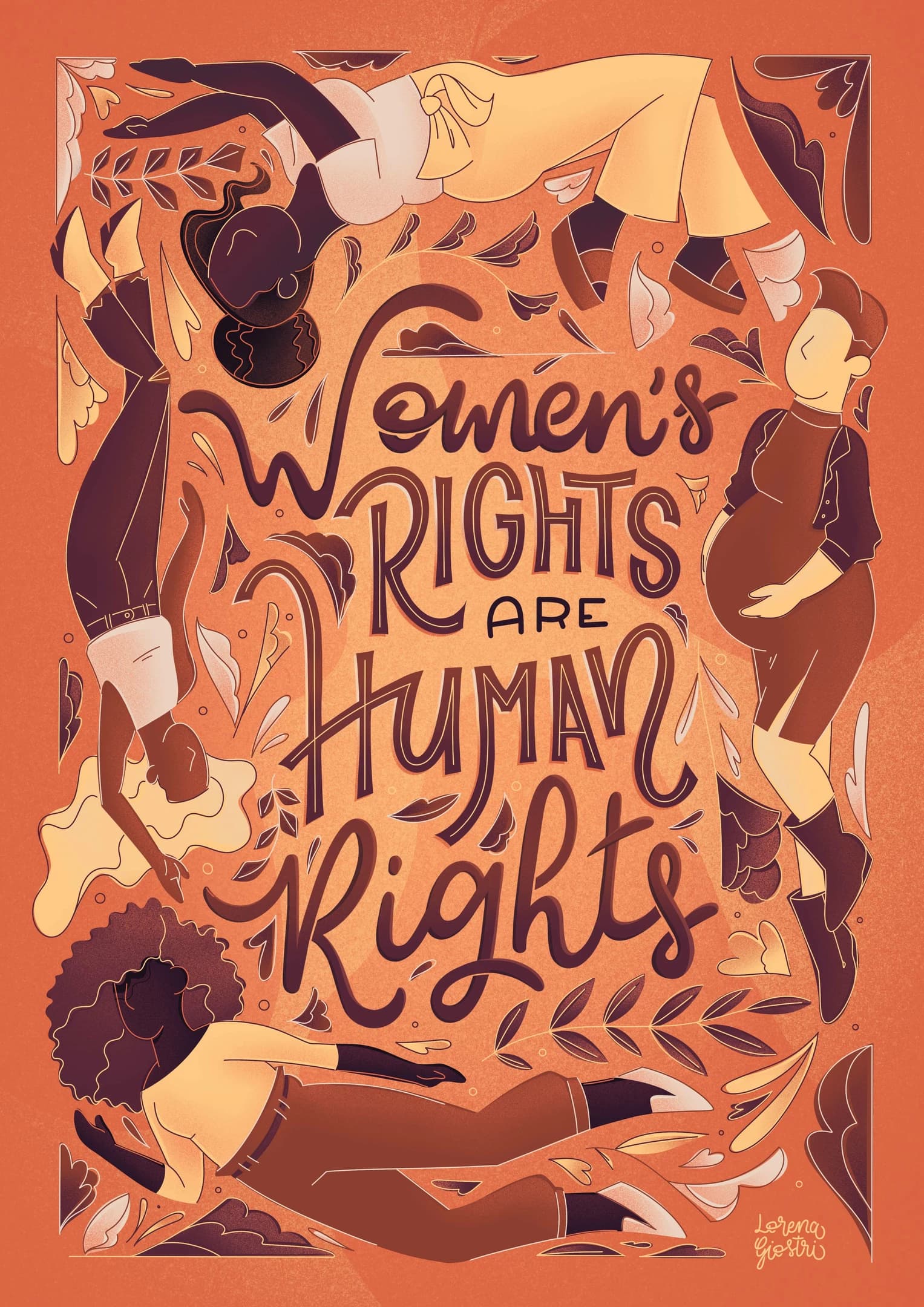
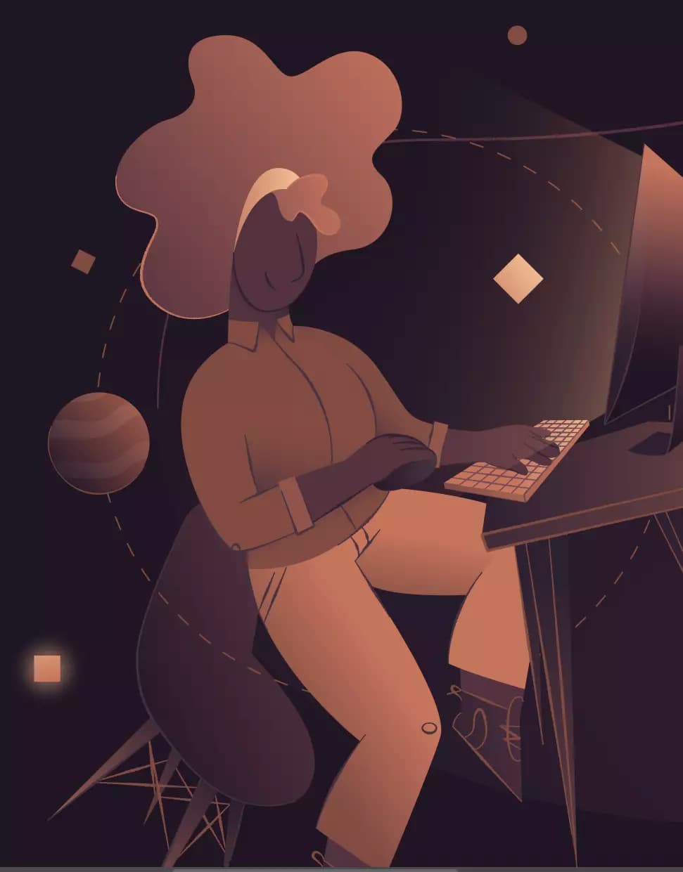
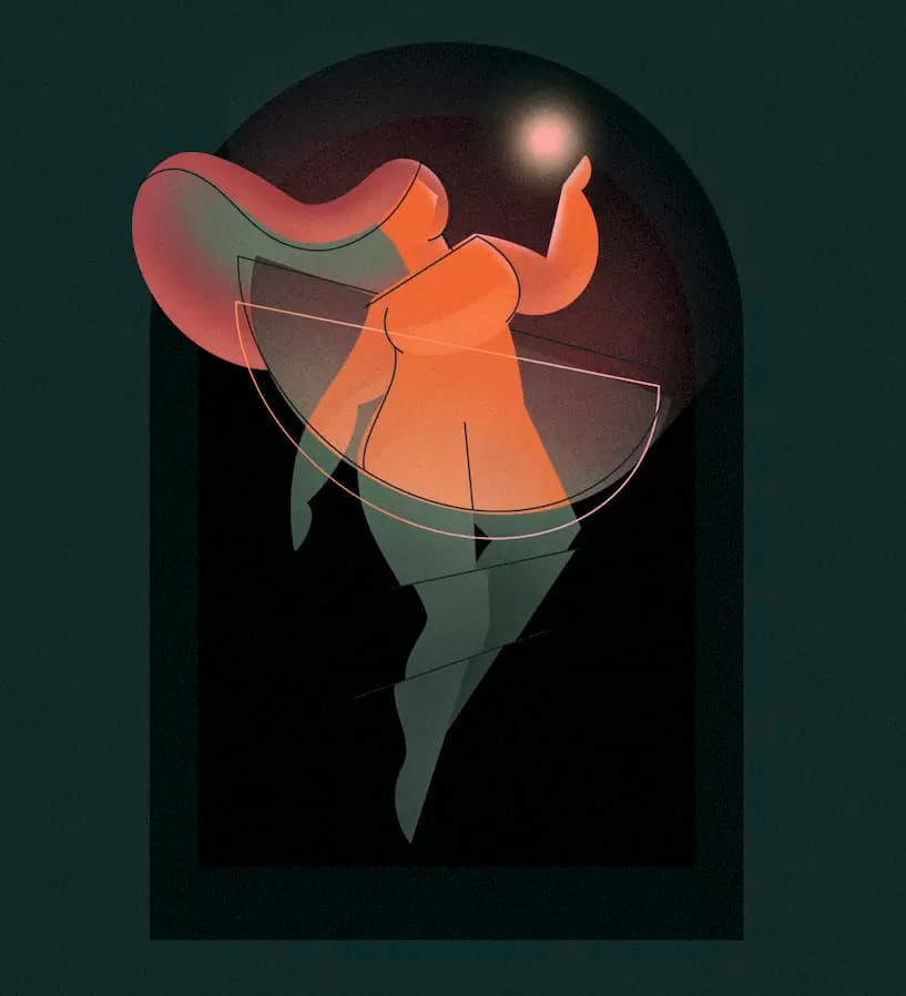
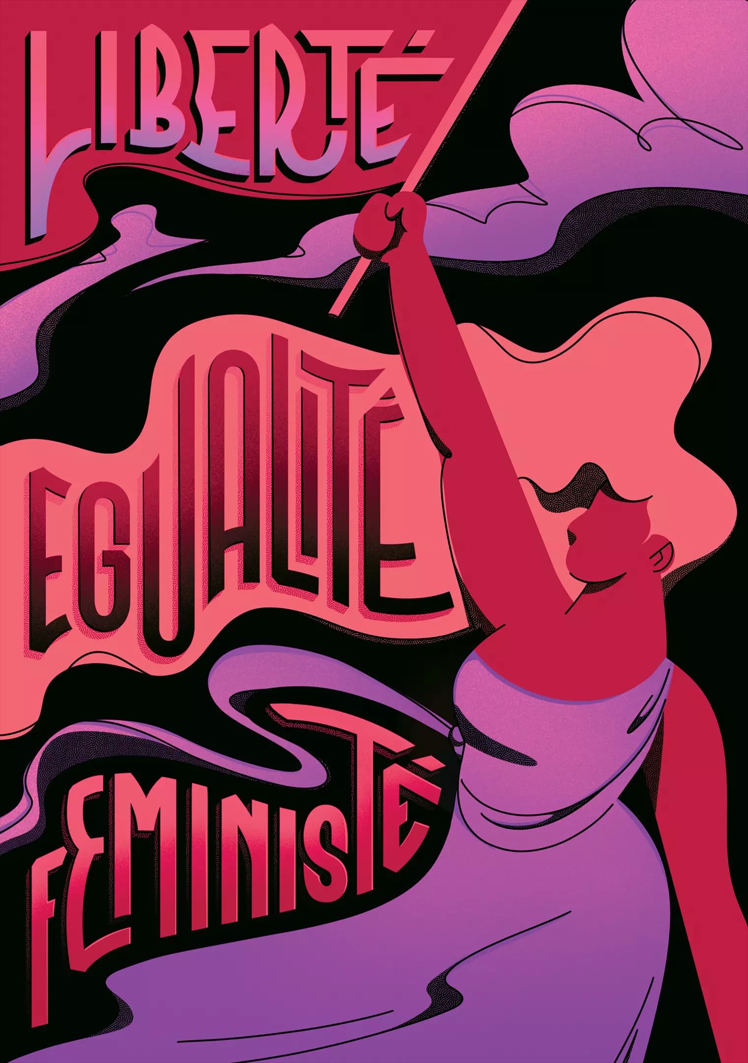
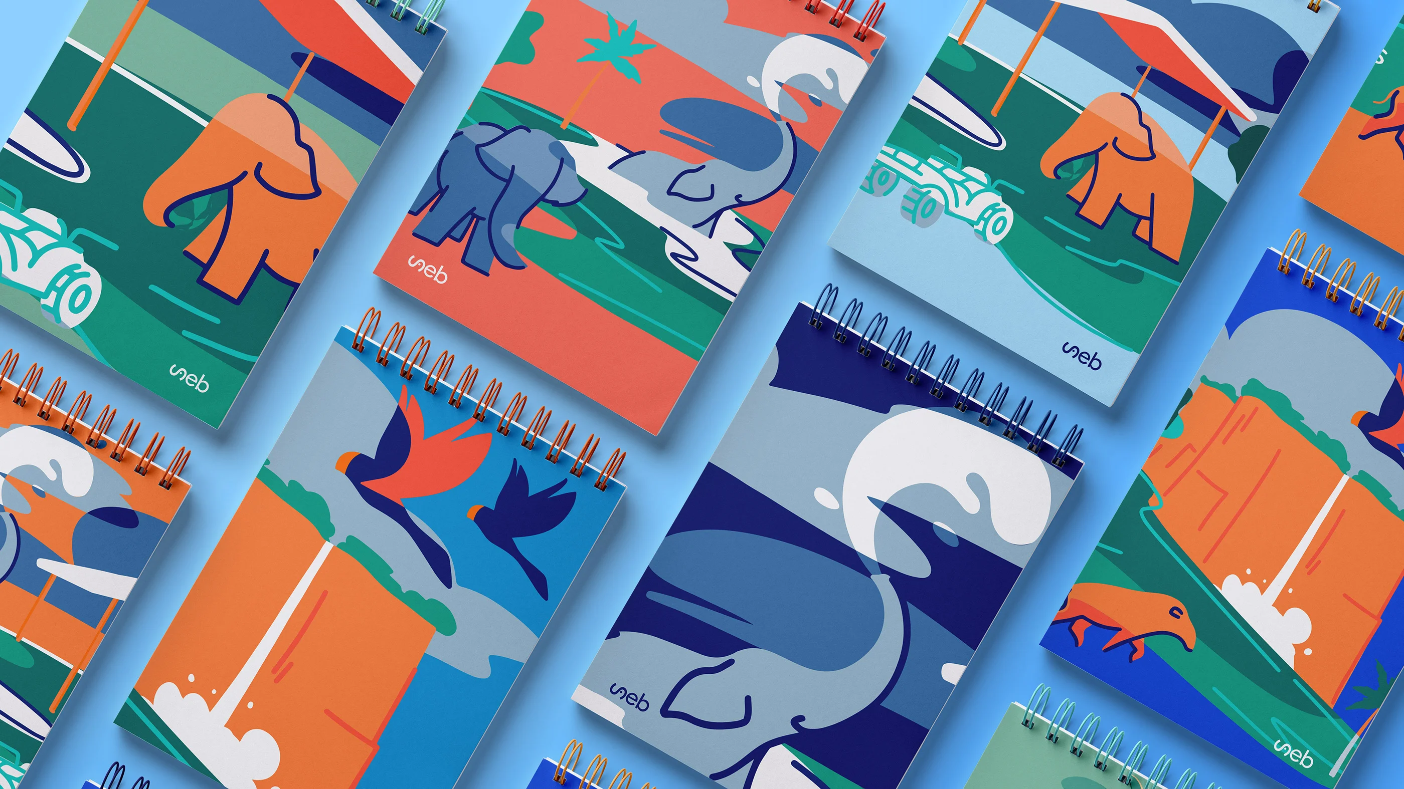
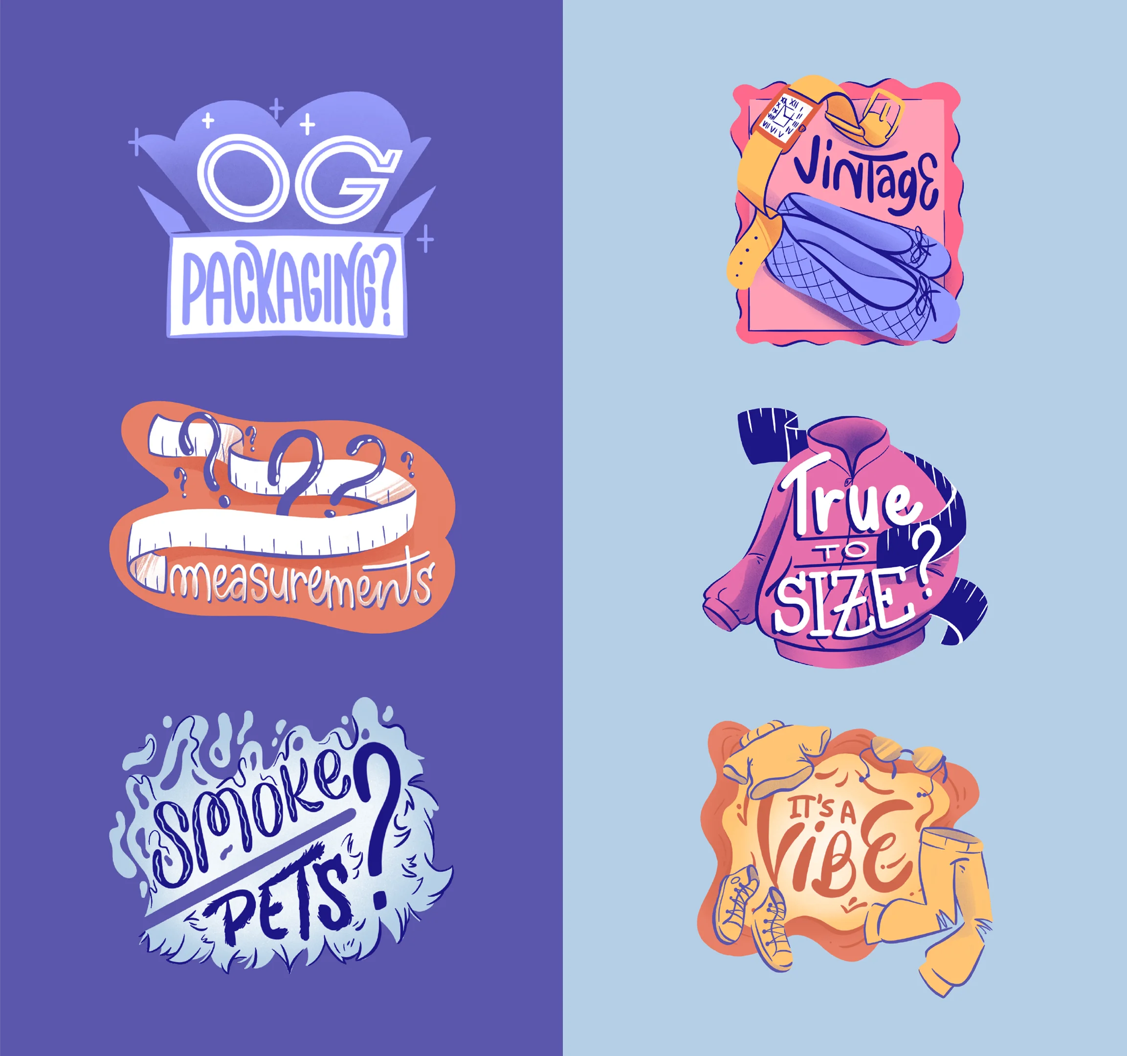
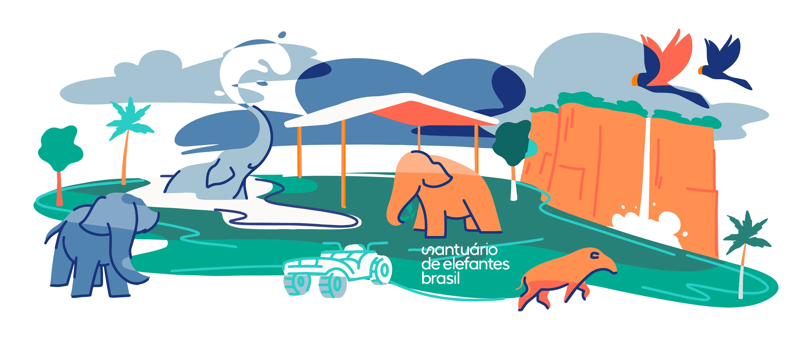
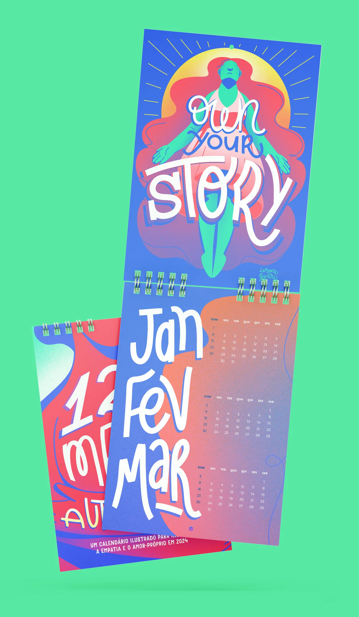
Lorena: My work has a lot of influences and I usually say I’m a cultural junkie. I’m always looking for beautiful things; new cultural experiences and also different things besides the mainstream. This ends up being reflected in my work through unconventional color combinations, and inclusiveness of LGBTQIA+ as also different nationalities and minorities. On some level, this also applies to experimentation with style and media, which I love to do and challenge myself whenever possible.
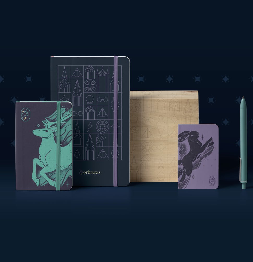
Lorena: I love studying how to overcome a challenge. For me, the key to success for this will always be methodology and organization. My last challenge (which hasn’t even been officially announced yet) was to paint four illustrated murals in loco at an important corporate company in my country.
It was a very complex job that required my knowledge of software, interior design, and also my knowledge of on-site painting to get the job done with the perfect finishing. This work took about 10 days to paint in total.
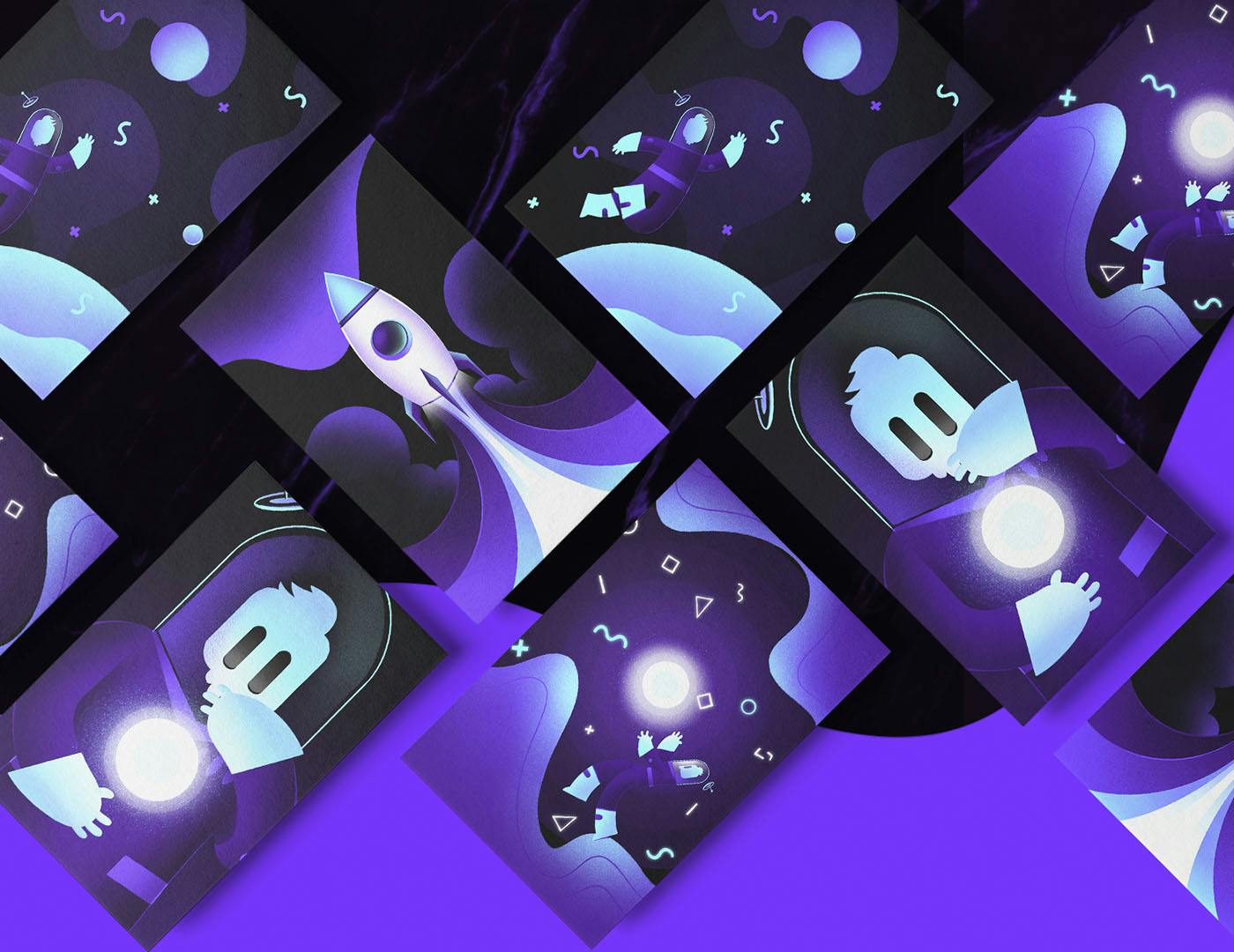
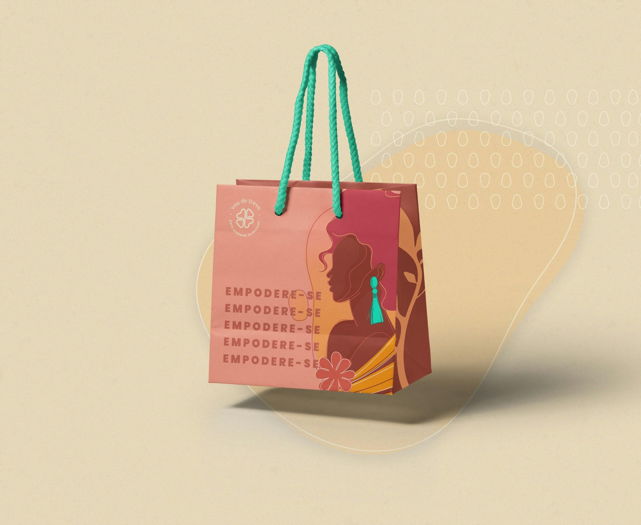
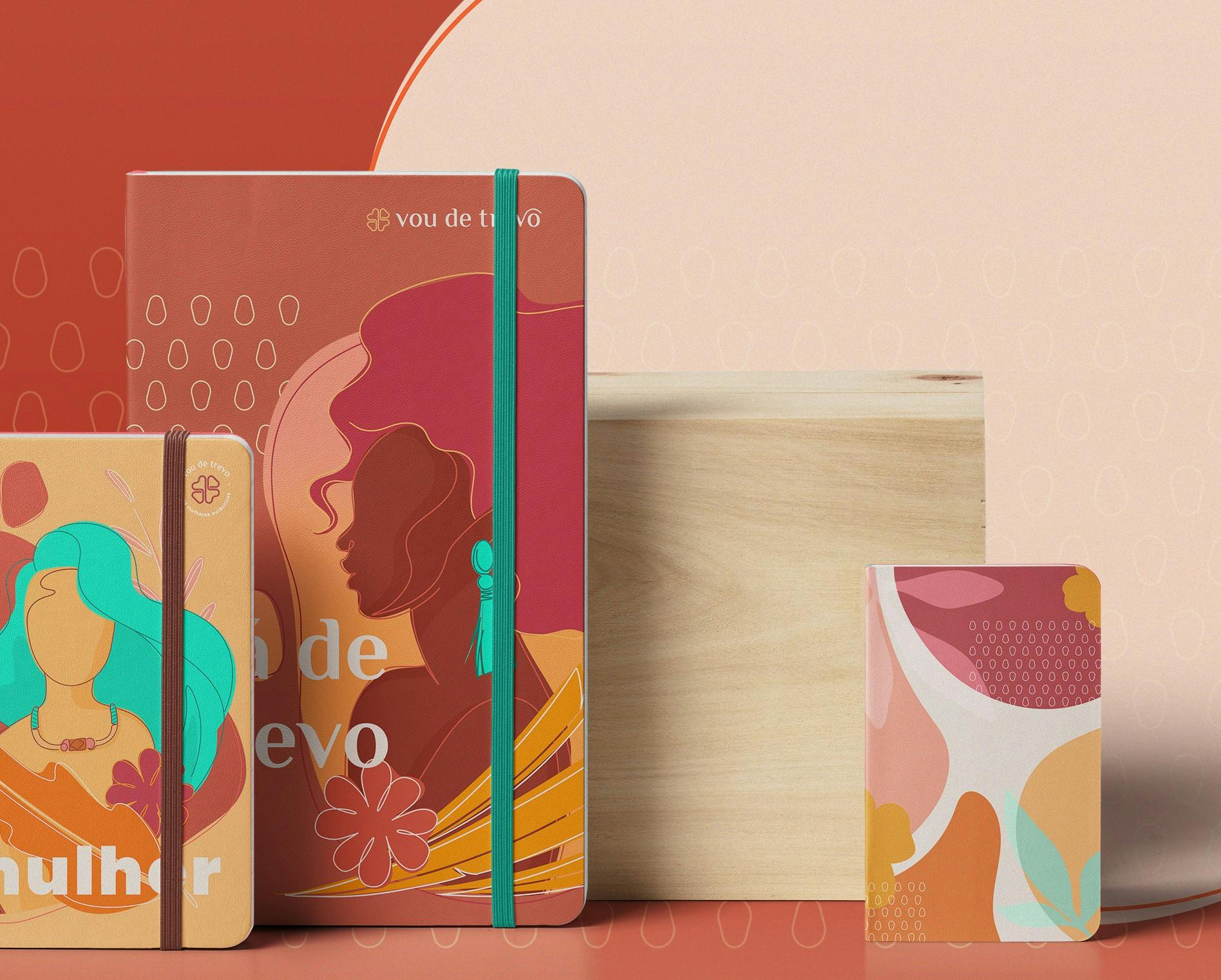
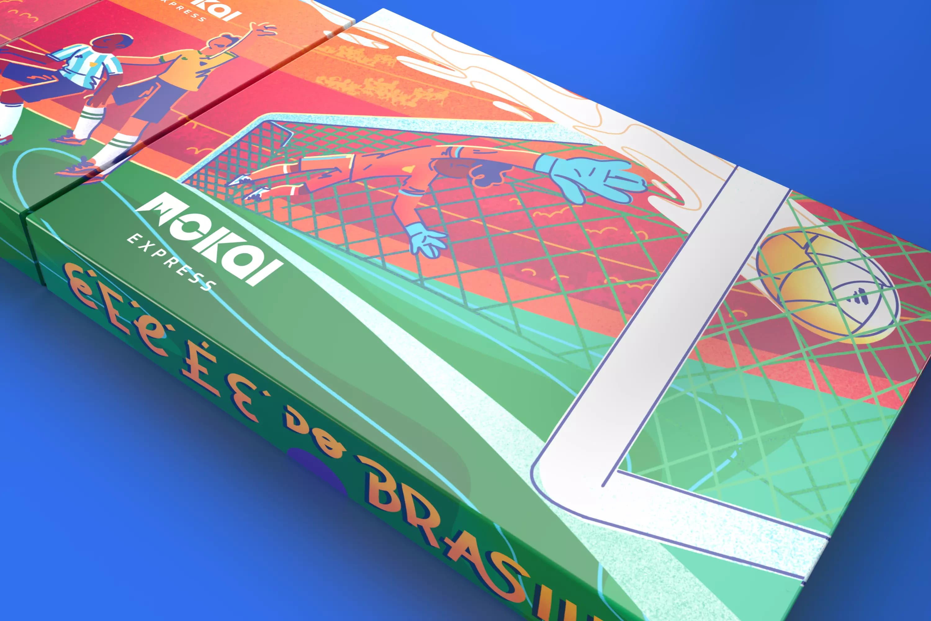
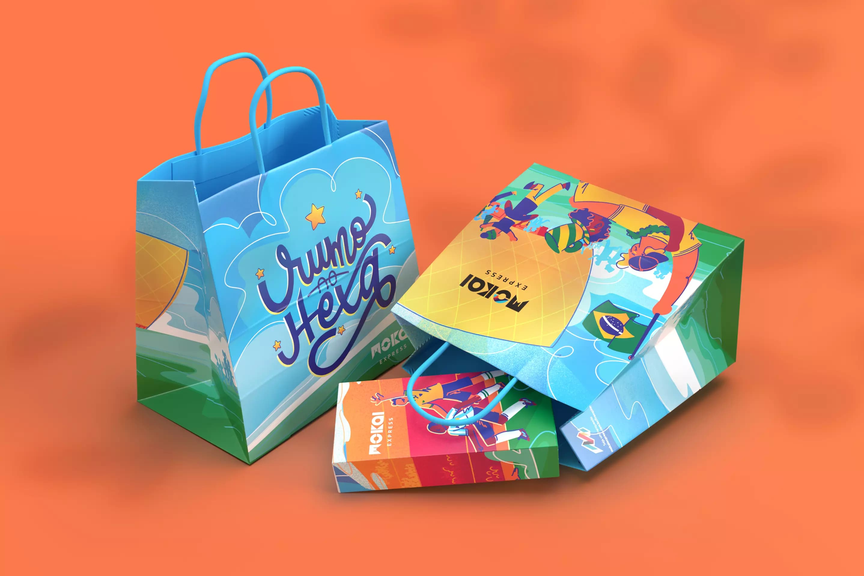
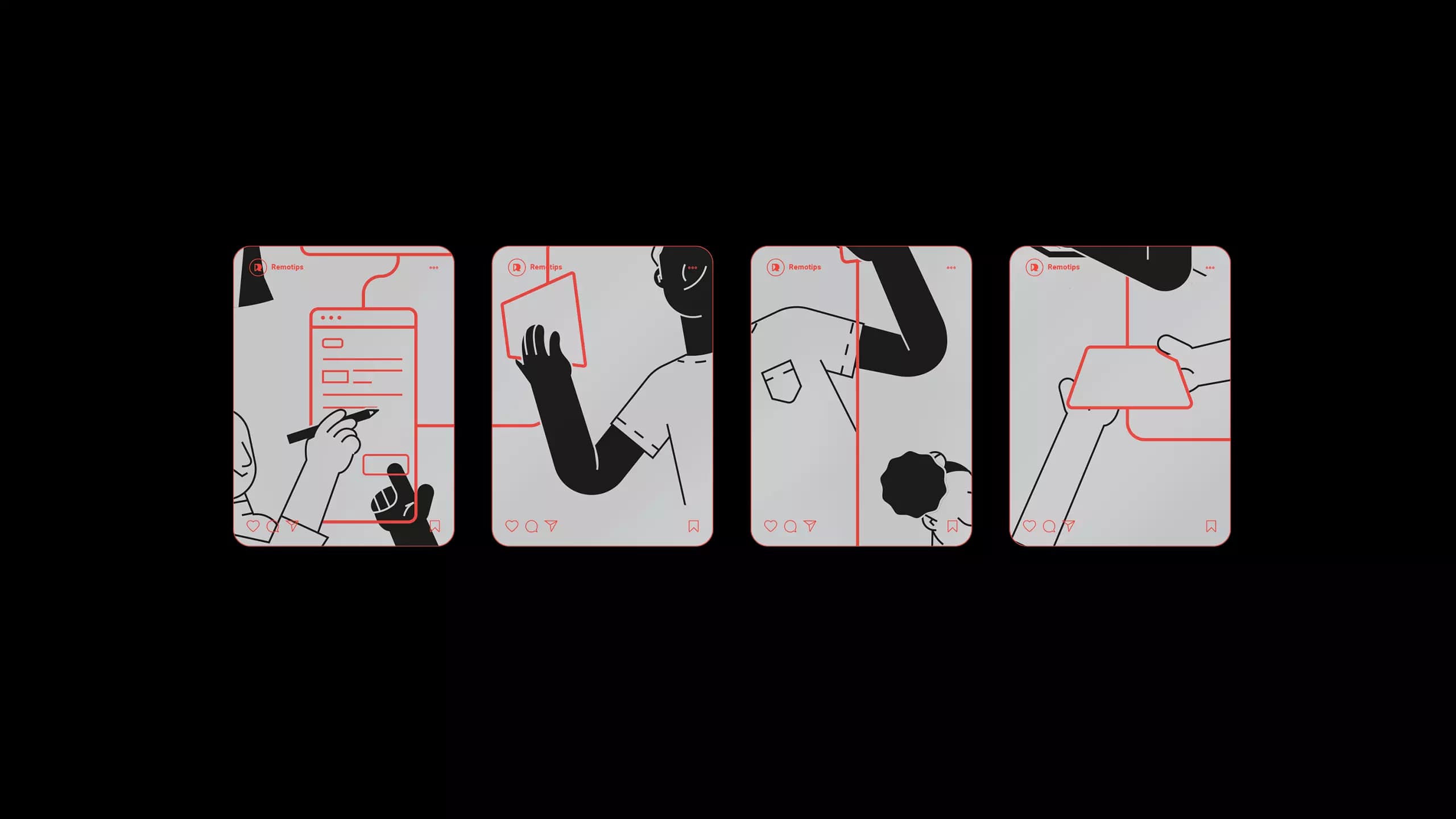
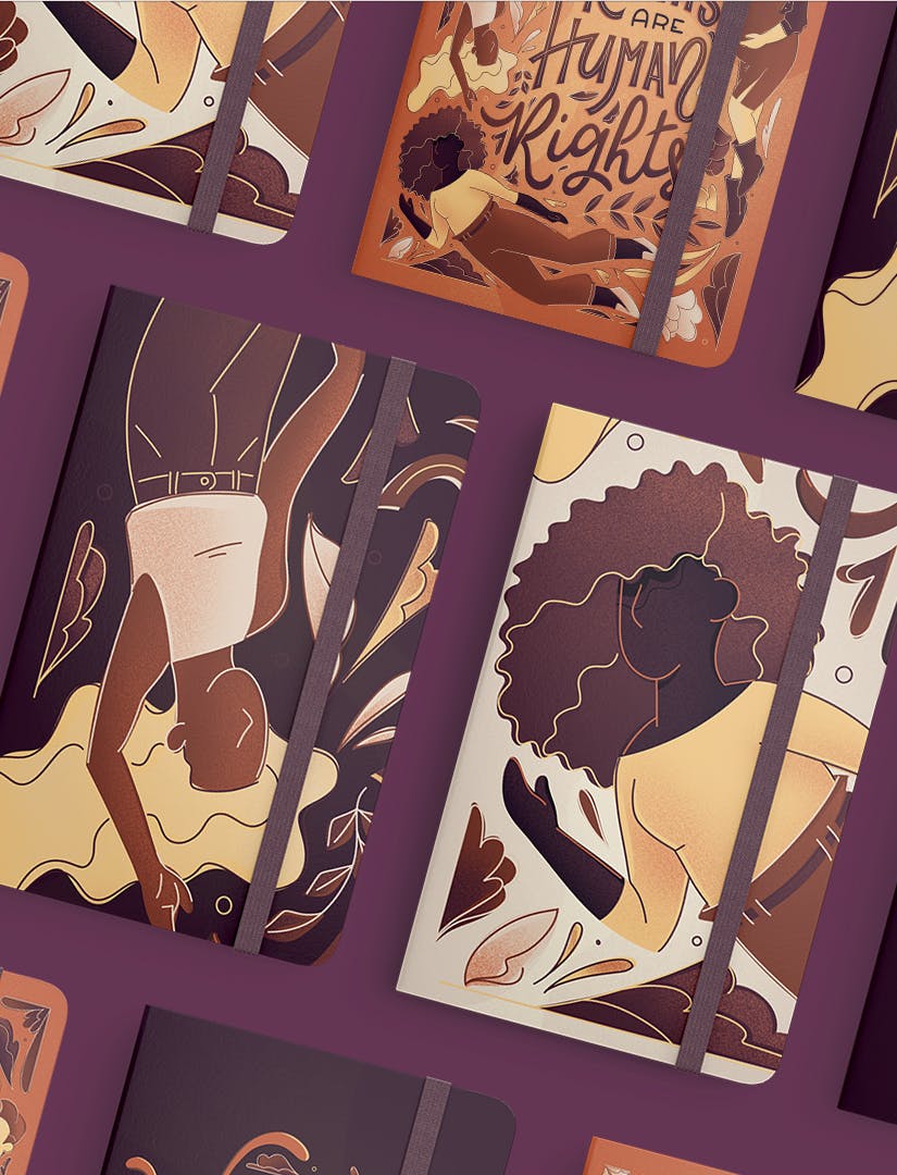
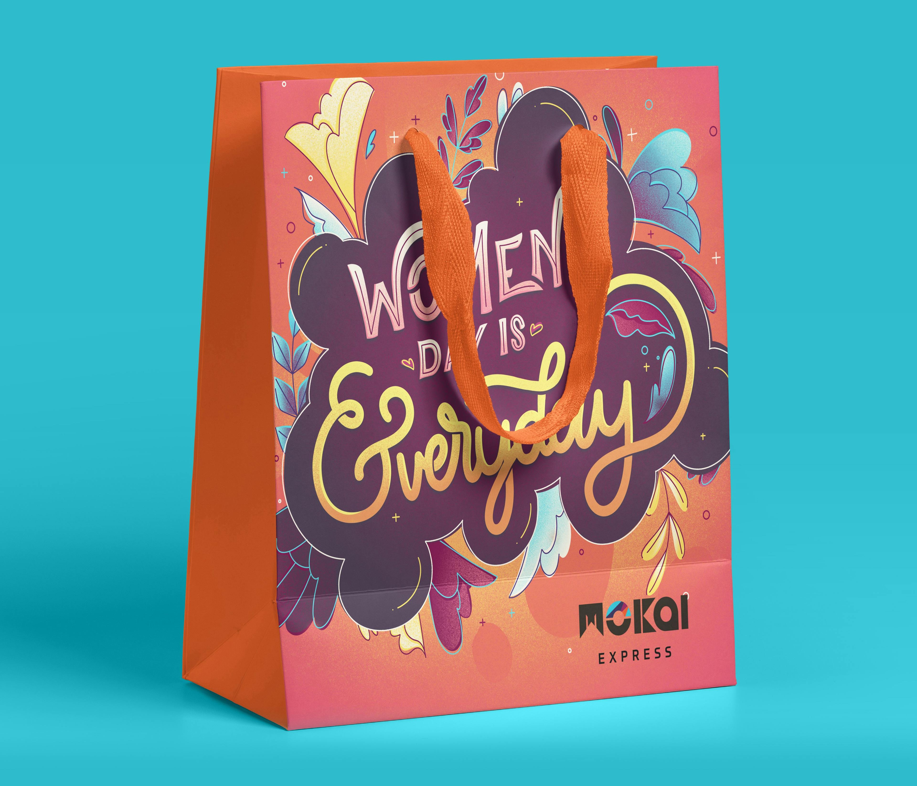
Lorena: At the moment, I love doing editorial projects and also illustrations for packaging. New media that allows us to see our work taking physical form is always very exciting.
“I’m always looking for beautiful things; new cultural experiences and also different things beyond mainstream”
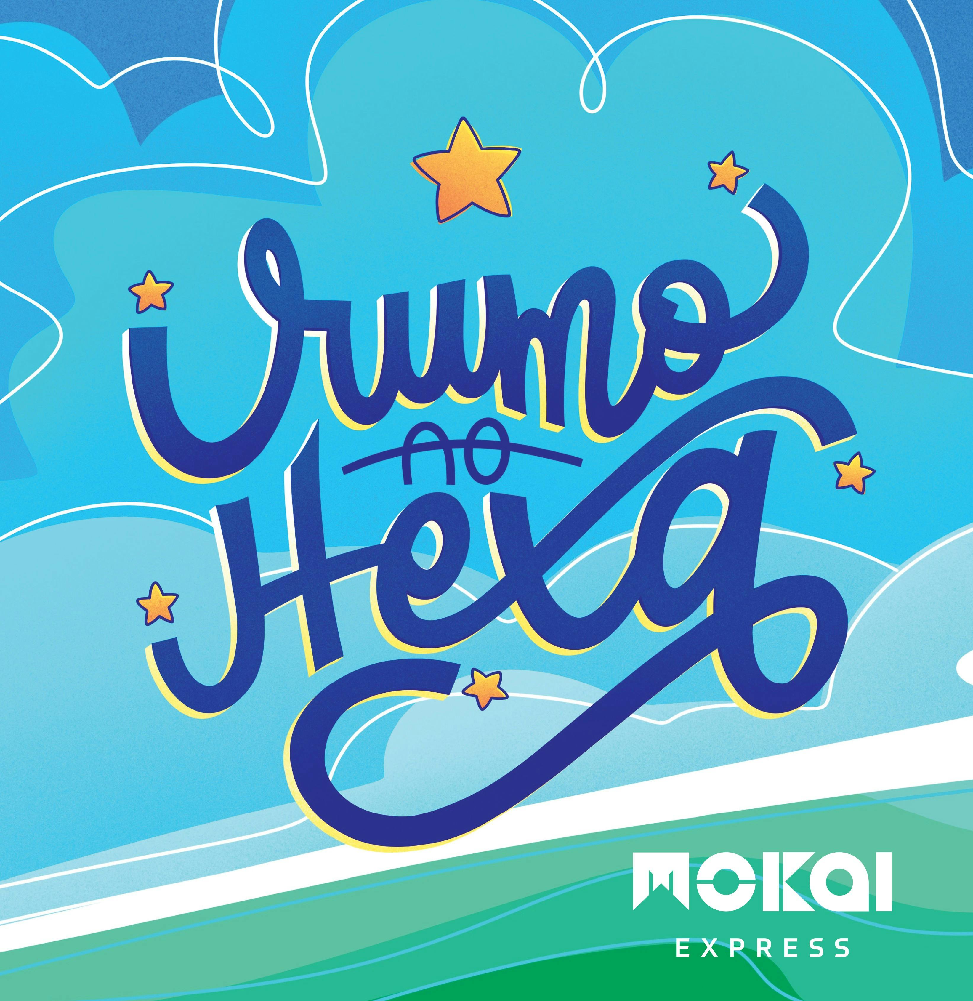
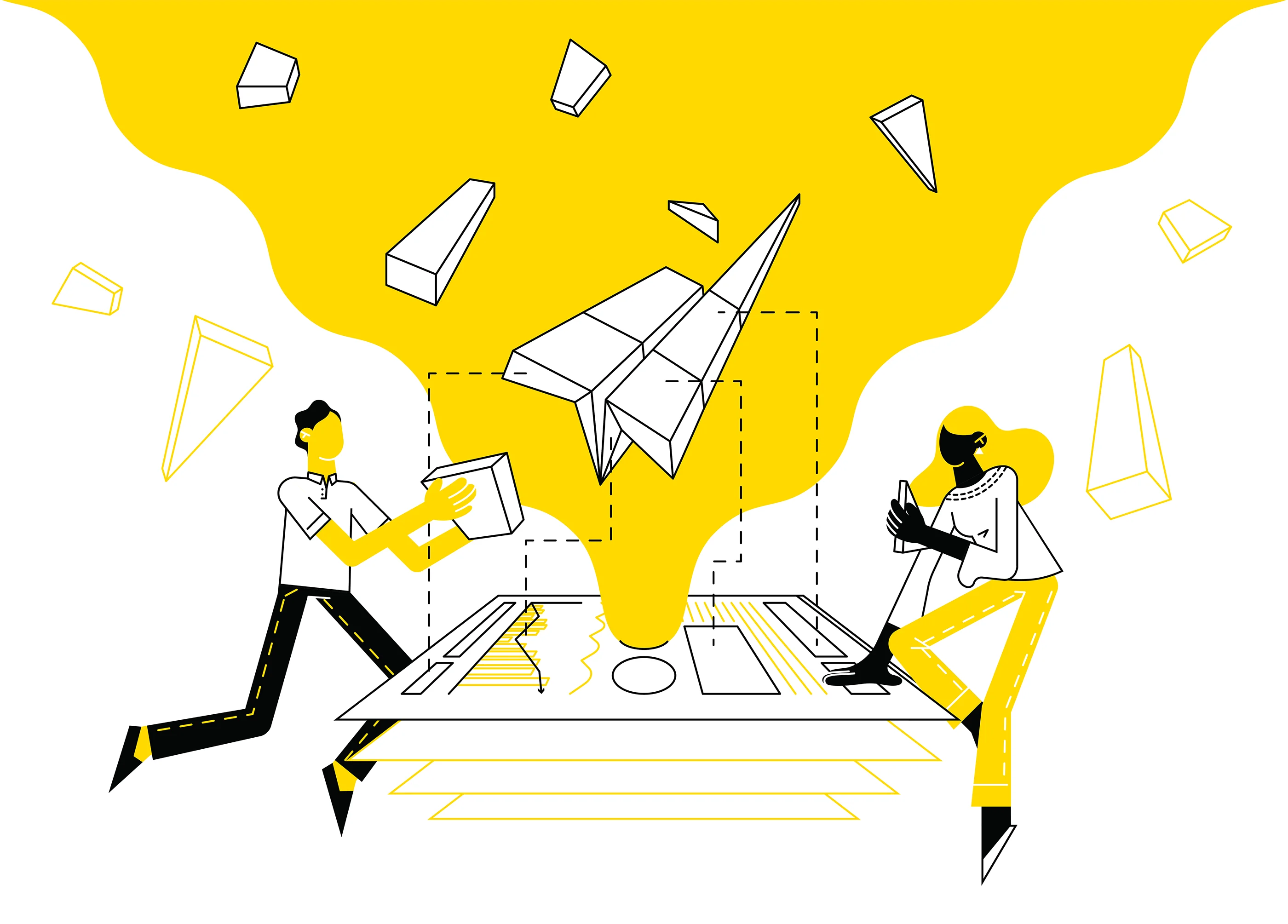
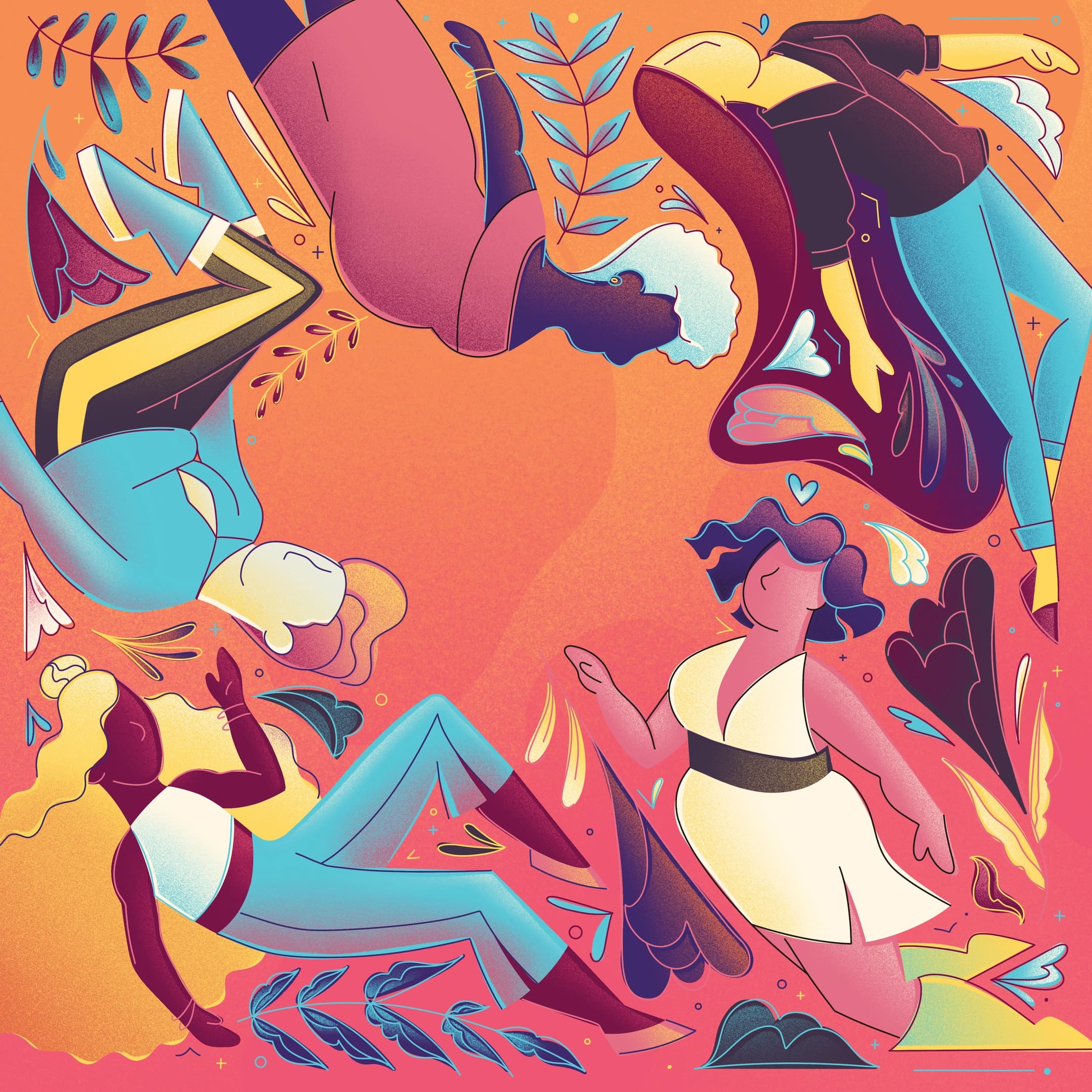
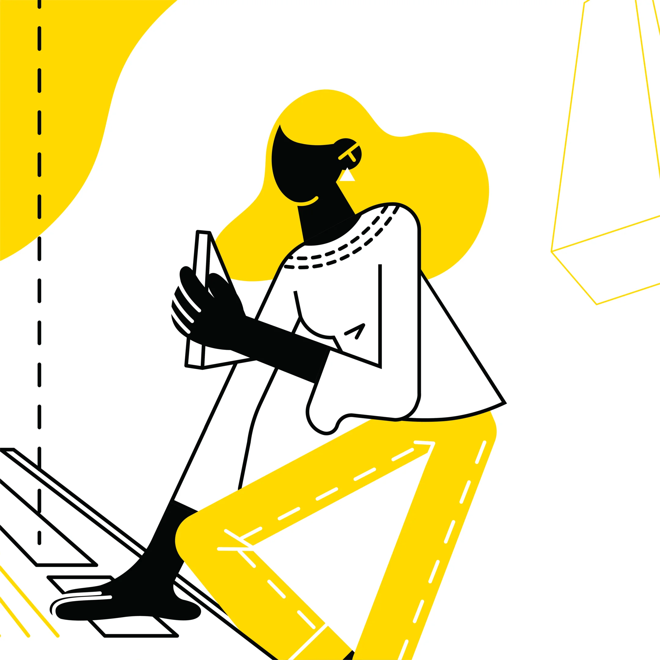
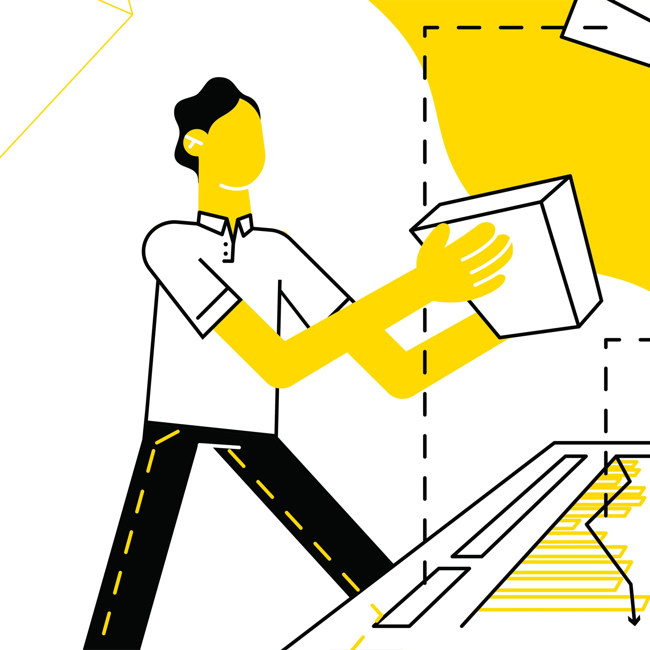
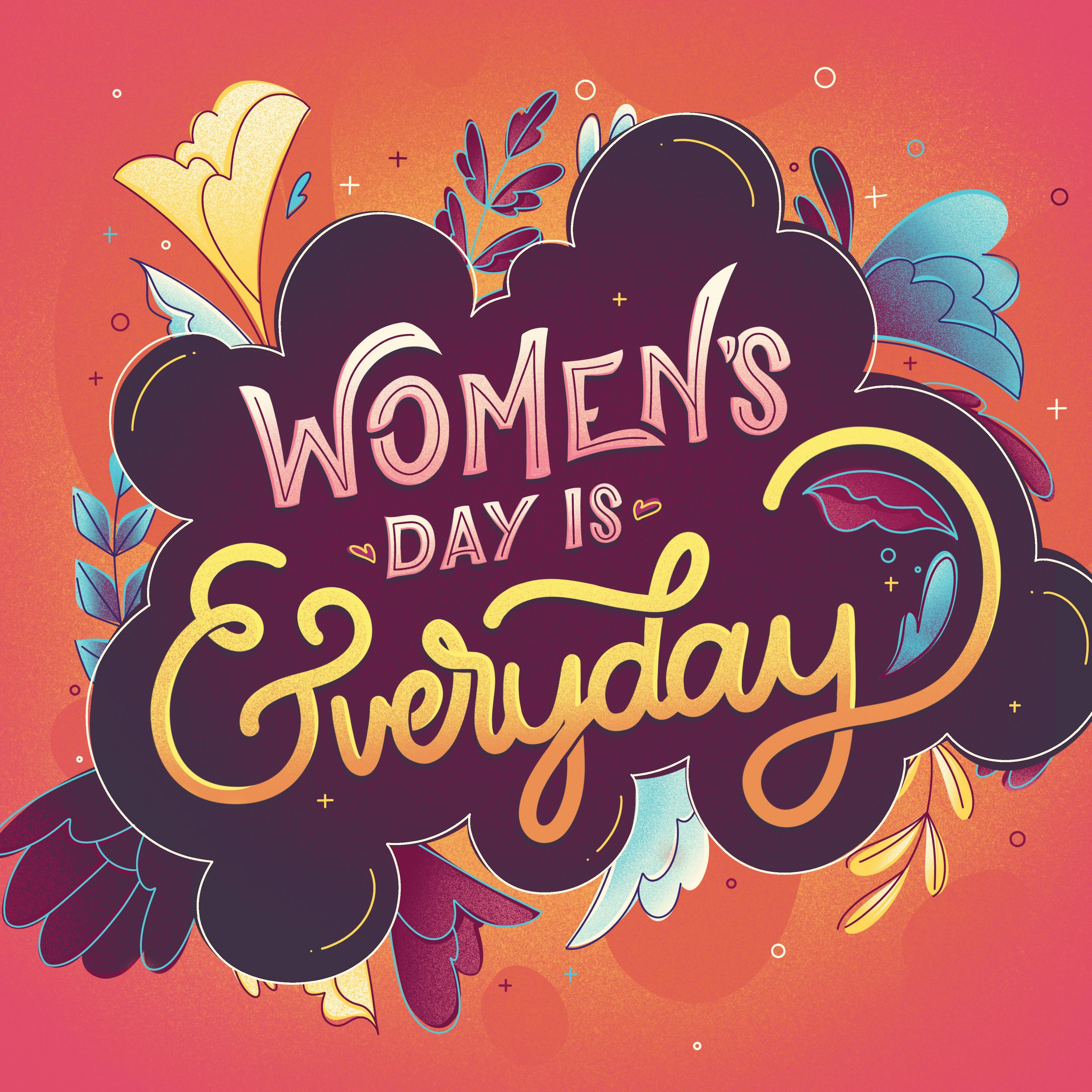
Lorena Giostri: I always try to bring unusual color combinations to my work; I believe that makes it unique. But another important aspect of my work is the comfort and happiness I like to show. In color, this is transmitted as warm colors and that’s why I always try to bring a yellowish or orange tone to the illustration.

Lorena: Happy people are always present in my work because of its nature. My illustrations are made for editorial and to illustrate ideas for my client’s clients, so the vast majority of characters must be happy or satisfied with their services or products.
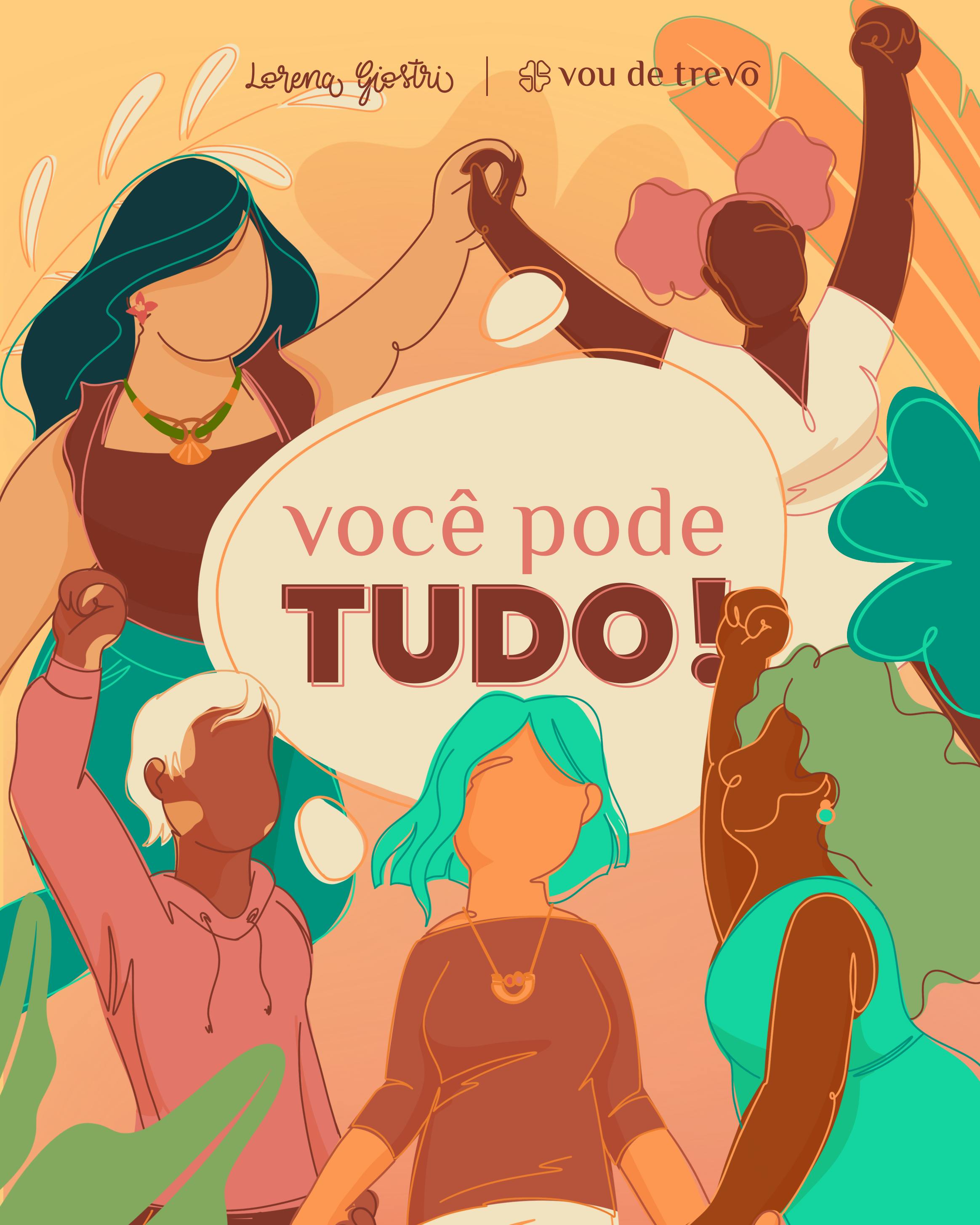
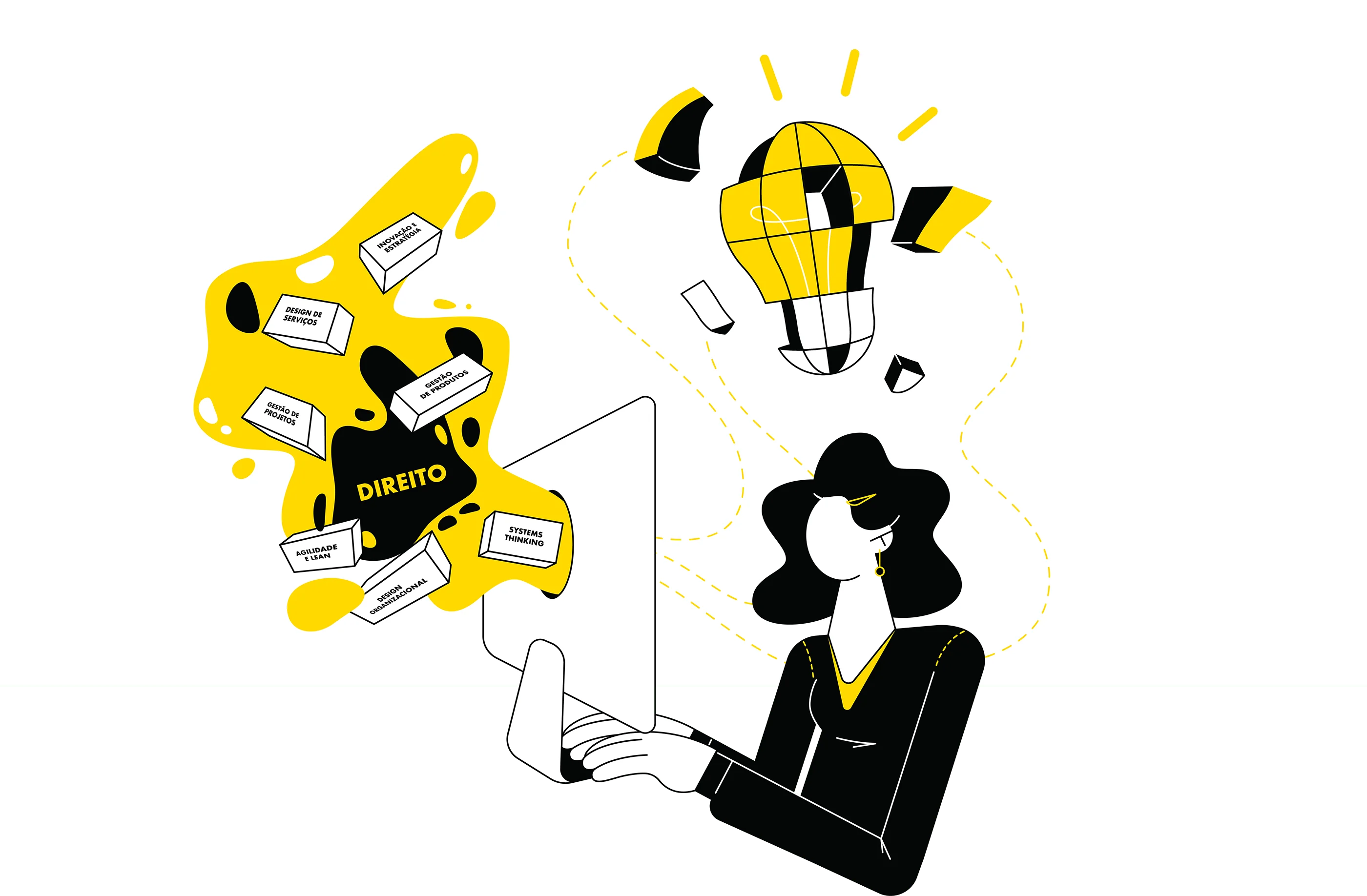
Lorena: My job has many different techniques that may or may not be present in my current project depending on the briefing. However, I have some resources up my sleeve that I always use to keep this illustration in my style, such as a well-selected and restricted color palette, strong colors, character shapes (which can have distorted proportions)’ a well-selected set of shapes, and textures and even displaced strokes.
Lorena: In your portfolio keep projects that you are very proud of and what you wanna do from now on.
