
In the world of design and branding, the interpretation of colours plays a pivotal role in crafting a brand's identity and communication strategy. Colours have a profound ability to evoke emotions, convey messages, and influence perceptions. This makes understanding colors and their meanings essential for anyone looking to create impactful and memorable brand designs.
The Basics: Colors and Meanings
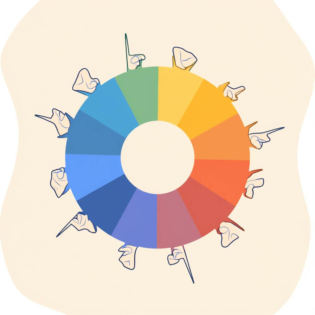
To harness the psychological power of colour, it's crucial to comprehend the meanings behind different hues. While the interpretation may vary slightly across cultures, some associations have become almost universal. For instance, blue is often perceived as a color that signifies trust, loyalty, and professionalism. But what does blue represent in different contexts? A deep dive into the meaning of the color blue in branding reveals its versatility - it can convey calmness and serenity or allude to technical innovation and authority, depending on its shade and application.
Why Colour Matters in Branding
- Creating Emotional Connections: Colours communicate at a subconscious level, forging emotional bonds with the audience. When a brand chooses the right palette, it can resonate more deeply with its intended demographic. Does a brand want to evoke excitement and energy? Red might be the hue. For a sense of tranquility and reliability, blue is often the go-to choice.
- Differentiation: In a crowded marketplace, distinct brand colours can set businesses apart. They function as visual cues that attract attention and enhance memorability, playing a crucial role in the brand’s overall identity.
- Cultural Relevance: Colours can have different interpretations across cultures, which means global brands need to be mindful of their choices. While white might suggest purity in Western cultures, it’s often associated with mourning in some Eastern cultures.
AI made with Dean Jones
The Nuances of Blue in Branding
In further exploring what does blue represent, we find that it often communicates trust and reliability—qualities indispensable for brands in the financial and technological sectors. Companies like IBM and PayPal utilize blue to signal their dependability and authority. Additionally, lighter shades of blue are popular in wellness and lifestyle brands for their calming effect, promoting peace and well-being.
FAQs: Interpretation of Colours in Branding
Can the interpretation of colours change over time?
Yes, cultural shifts, trends, and societal changes can influence how colours are perceived. It’s essential for brands to periodically reassess their color choices.
How does context affect the interpretation of colours?
The same color can take on different meanings based on context. For instance, blue might denote tranquility in a spa setting, while in a corporate setting, it may suggest professionalism and trust.
Is it important for a brand to stick to its chosen color palette?
Generally, consistency in color use enhances brand recognition, but flexibility can be advantageous for special promotions or campaigns.
FAQ on Interpretation of Colours in Branding and Design
What is the significance of different colours in design and branding?
Colours play a significant role in design and branding because they have the power to evoke emotions, communicate messages, and influence perception. Each colour can create a different atmosphere and convey certain qualities associated with a brand. For instance:
- Red is often associated with energy, passion, and urgency. It can stimulate excitement and is commonly used in sale announcements.
- Blue often conveys trust, professionalism, and calmness. It's frequently used in the corporate sector and healthcare to establish reliability.
- Green symbolizes nature, health, and growth, making it a popular choice for eco-friendly and wellness brands.
- Yellow conveys happiness, optimism, and warmth. Brands targeting younger demographics often use yellow to draw attention.
- Black implies sophistication, luxury, and elegance. Many high-end brands use black to communicate exclusivity and prestige.
- White represents purity, simplicity, and cleanliness. It's a staple in minimalist design and is used to create a sense of space and purity.
How can colour interpretation influence a brand's image?
Colour interpretation can significantly influence how a brand is perceived by its audience. Colour choices can make a brand appear more approachable, trustworthy, luxurious, or cutting-edge. They can impact a consumer’s decision-making process by:
- Enhancing Brand Recognition: Consistent use of specific colours helps in creating a strong visual identity, making the brand easily recognizable.
- Evoking Emotional Responses: Different colours can trigger specific emotions and feelings, which can be leveraged to connect with the audience on a deeper level.
- Communicating Brand Values: Colours can be used to subtly communicate the core values and messages of a brand, aligning the brand’s image with its mission.
- Segmenting the Market: Different colours attract different demographics. For example, vibrant colours may appeal to younger audiences, while muted palettes may attract a more mature clientele.
Are there universal interpretations for specific colours in design and branding?
While there are general trends and associations that are widely recognized, colour interpretation can vary significantly depending on cultural, contextual, and individual factors. For instance:
- White might symbolize purity in some Western cultures, but in certain Eastern cultures, it is associated with mourning.
- Black is considered elegant and luxurious in some areas but may represent mourning and negativity in others.
- Red can signify good fortune and joy in some Asian cultures but may represent danger or warning in others.
Designers and branding experts should consider their target audience's cultural background and local interpretations when selecting colour palettes to ensure the intended message is universally understood and resonates positively.
AI made with Dean Jones
How does colour psychology apply to design and branding?
Colour psychology is the study of hues as a determinant of human behavior. It’s a tool that can be used to understand how colour affects perception and how it can be applied strategically in branding and design:
- Influencing Mood and Behavior: Certain colours can make people feel happy, sad, angry, or indifferent, influencing consumer mood and behavior toward the brand.
- Guiding Product Perception: Colour can affect how people perceive the attributes of a product. For example, a dark colour might make a product seem more heavyweight, while a light colour may make it seem lightweight.
- Supporting Brand Differentiation: Unique colour palettes can set brands apart from their competitors, providing a competitive edge in crowded markets.
- Enhancing User Experience: By using colour strategically, designers can improve the readability, navigation, and overall user experience of a product or a website.
Conclusion
The interpretation of colours is an integral part of effective design and branding strategies. By understanding the meanings behind different hues, brands can create emotional connections, differentiate themselves from competitors, and ensure cultural relevance. The colour blue, with its multifaceted meanings, serves as a prime example of how a single color can carry diverse interpretations and applications across different contexts. In our ever-evolving global market, staying attuned to the changing dynamics of color interpretation ensures that brands remain impactful, relatable, and memorable.